Chapter 7 Data Visualization with ggplot2
In this chapter, we will learn using ggplot2 to carry out data visualization tasks. Before the lecture, please install the package first.
install.packages('ggplot2') ## you only need to run this code once7.1 Grammar of Graphics (gg)
We have grammar for languages. Similarly, we have grammar for graphics. That’s where gg of ggplot2 comes from. ggplot2 has seven grammatical elements listed in the table below (DataCamp 2019).
| Element | Description |
|---|---|
| Data | The dataset being plotted. |
| Aesthetics | The scales onto which we map our data. |
| Geometries | The visual elements used for our data. |
| Facets | Plotting small multiples (subplots). |
| Statistics | Representations of our data to aid understanding. |
| Coordinates | The space on which the data will be plotted. |
| Themes | All non-data ink. |
Let’s take the codes below as an example to show how different elements work in ggplot2. Then, we might have an idea what is each element and how does it work.
Firstly, we need to import the packages and the Minneapolis ACS dataset. We will use dplyr to wrangle the dataset.
library(ggplot2)
library(dplyr)
minneapolis <- read.csv('minneapolis.csv')ggplot(minneapolis, ## Data
aes(x = AGE, y = INCTOT)) + ## Aesthetics
geom_point() + ## Geometries
facet_wrap(vars(YEAR)) + ## Facets
stat_smooth(method = "gam", se = FALSE, col = "blue") + # Statistics
scale_x_continuous('Age', limits = c(0, 100)) +
scale_y_continuous('Personal income (dollars)') + # Coordinates
labs(title = 'Age and personal income in Minneapolis (2010-2019)') +
theme_bw() # Themes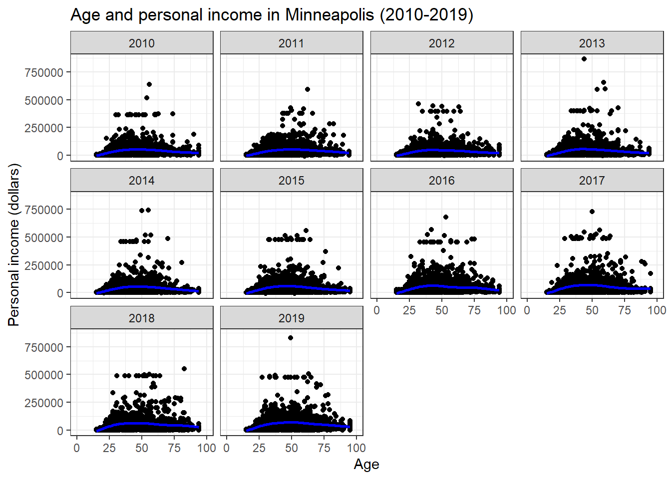
The figure shows the scatter plots of age and personal income in the city of Minneapolis from 2010 to 2019. In addition, the plot fits a nonlinear relationship (the blue line) between the age and personal income for each year.
7.2 Data, Aesthetics, and Geometries
Generally, if you want to draw figures with ggplot2, you need at least three elements, which are data, aesthetics, and geometries. Data is the dataset we want to visualize. Aesthetic specifies how to map the variables to the scales in plots. Geometry indicates the plot type and related attributes. Take the example above again. We want to visualize the variables of AGE and TOTINC (aesthetic) of the dataset minneapolis (data, the Minneapolis ACS dataset) with a scatter plot (geometry). In summary,
Similar to dplyr, ggplot2 also has its own fashion of coding. We start with the ggplot() function. Please pay attention that there is no 2 in the name of the function. In the function, we first indicate the name of the dataset (usually a data frame). Then we use aes() to indicate the scales we want to map our data. Here, we map AGE to x axis, and TOTINC to y axis. Then we use a plus sign + to connect it to other functions. We are going to draw a scatter plot, so we use geom_point(). We only use a 2017 subsample from the Minneapolis ACS dataset. Note that the observations with missing values have been removed during plotting (that’s why we have a warning message).
## select a subsample of those in 2017
minneapolis_2017 <- filter(minneapolis, YEAR == 2017)

## this example give us a simple example of ggplot2
ggplot(minneapolis_2017, # Data
       aes(x = AGE, y = INCTOT)) + # Aesthetics
  geom_point() # Geometries
## Warning: Removed 454 rows containing missing values (geom_point).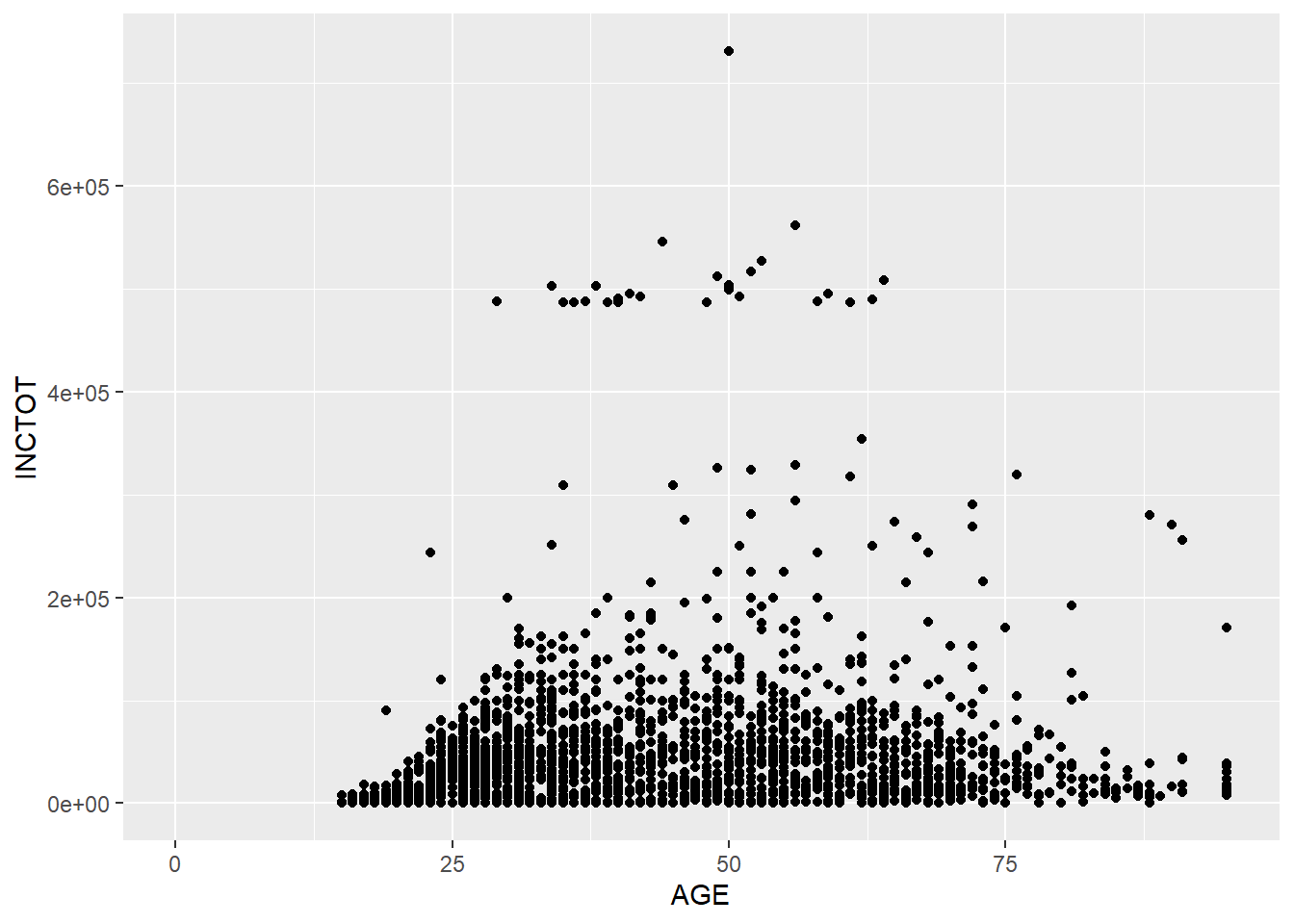
Based on this plot, we have a overall idea of the relationship between AGE and TOTINC. When age increases, people’s personal income increases. However, after a certain age, people’s personal income decreases as their age increases. (This relationship is just a type of correlation, not causality.)
In most cases, we will map variables to x axis and y axis. Therefore, we can replace the aes(x = AGE, y = INCTOT) to aes(AGE, INCTOT) to save some input (such as the codes below). We will stick to this style in the following lectures. Also, I recommend to put each function on a new line.
ggplot(minneapolis_2017, aes(AGE, INCTOT)) +
  geom_point()
We could add more scales as aesthetic elements in the plot. For example, we could use color to indicate the value of EDUC by adding col = EDUC. (col, color, and colour all work here.)
ggplot(minneapolis_2017, aes(AGE, INCTOT, col = EDUC)) +
  geom_point()
## Warning: Removed 454 rows containing missing values (geom_point).
Now we have more information in the result. While the respondent has a higher education level, s/he has a higher personal income.
Here, EDUC is a continuous variable, so ggplot2 uses the darkness of color to indicate the value. If we use a categorical variable or a factor (e.g., binomial variable), ggplot2 will use different colors to show different levels.
## remove observations with missing employment status from the dataset
## change EMPSTAT from numeric values to corresponding characteristic values
minneapolis_emp <- minneapolis_2017 %>%
  filter(EMPSTAT != 0) %>%
  mutate(
    EMPSTAT = case_when(
      EMPSTAT == 1 ~ 'Employed',
      EMPSTAT == 2 ~ 'Unemployed',
      EMPSTAT == 3 ~ 'Not in labor force'
    )
  )

ggplot(minneapolis_emp, aes(AGE, INCTOT, col = EMPSTAT)) +
  geom_point()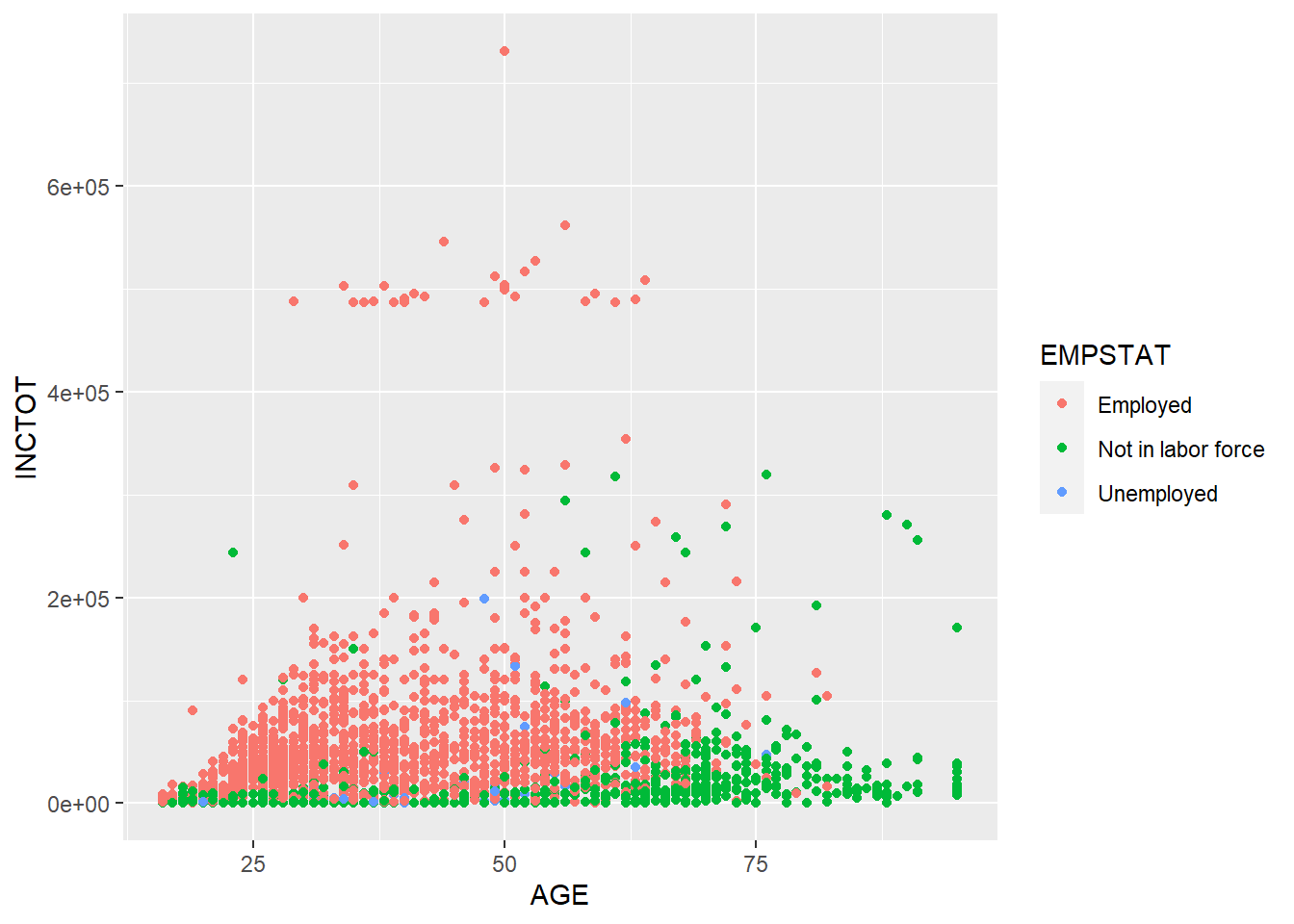
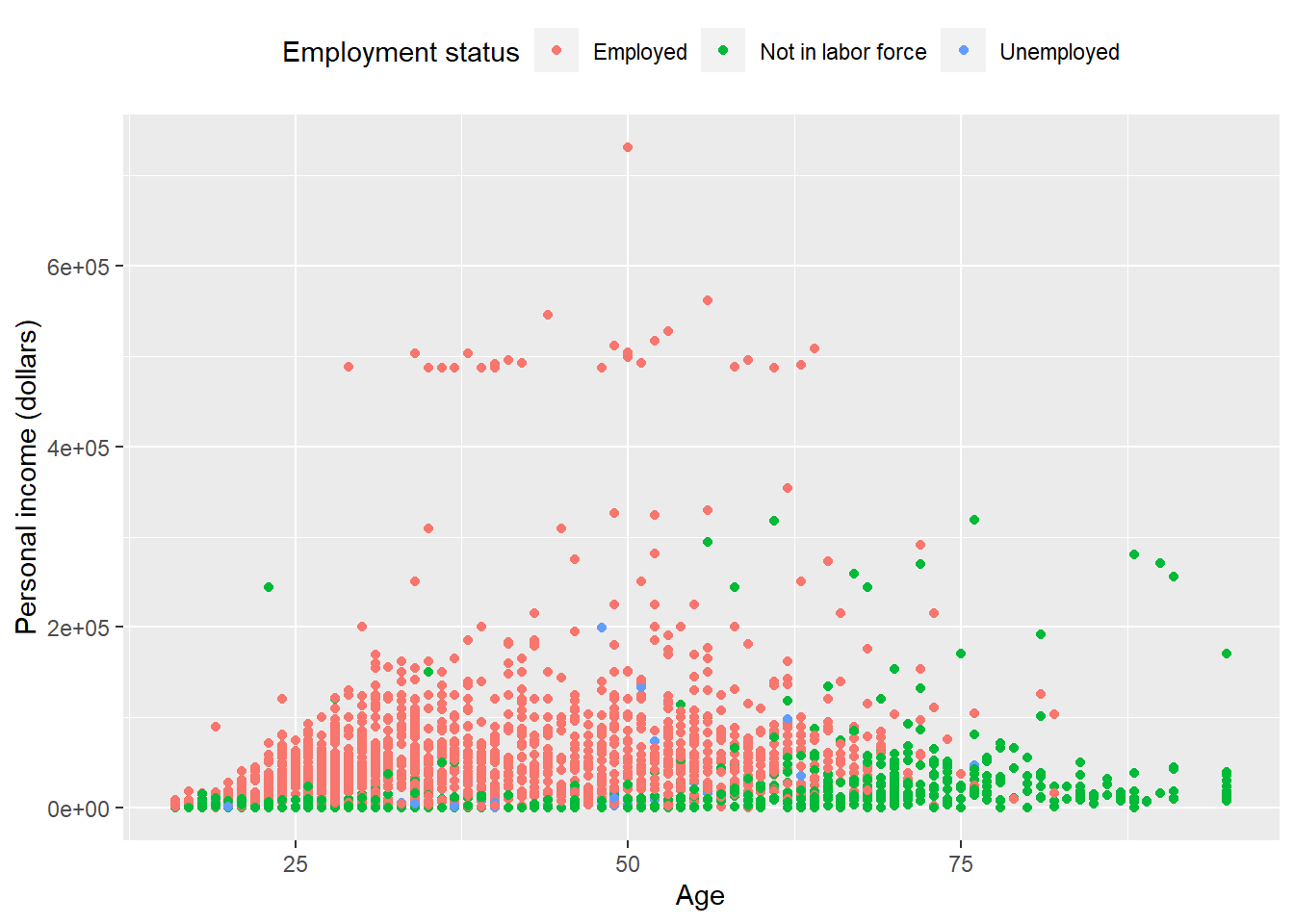
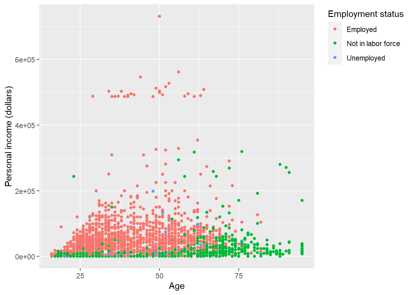
EMPSTAT stands for the employment status (employed, not in labor force, unemployed). R usually treats variables with characteristic values as factor. ggplot2 uses different colors to stand for different employment status. By reading the plot, we know that as age increases, more people are not in labor force. The personal income of employed people are higher than those not in labor force. (There are not many unemployed observations in this dataset, so it is hard to tell its pattern.)
Besides color, there are several other scales can be used in plots. Continuous variable and categorical variable will generate different results when being mapped to these scales. Usually, color and shape work well with categorical variables. Size works well for continuous variables. But it still depends on the dataset you are dealing with. The best practice is always try it for yourself.
| Scales | Description | Continuous variable | Categorical variable |
|---|---|---|---|
| x | x axis position | ✓ | |
| y | y axis position | ✓ | |
| size | Diameter of points, thickness of lines | ✓ | |
| alpha | Transparency | ✓ | ✓ |
| color | Color of dots, outlines of other shapes | ✓ | ✓ |
| fill | Fill color | ✓ | ✓ |
| labels | Text on a plot or axes | ✓ | |
| shape | Shape of point | ✓ | |
| linetype | Line dash pattern | ✓ |
If you want to set a scale to a fixed value, not a variable, you can do it in the geometry outside of aes().
ggplot(minneapolis_2017, aes(AGE, INCTOT)) +
  geom_point(col = 'blue')
## Warning: Removed 454 rows containing missing values (geom_point).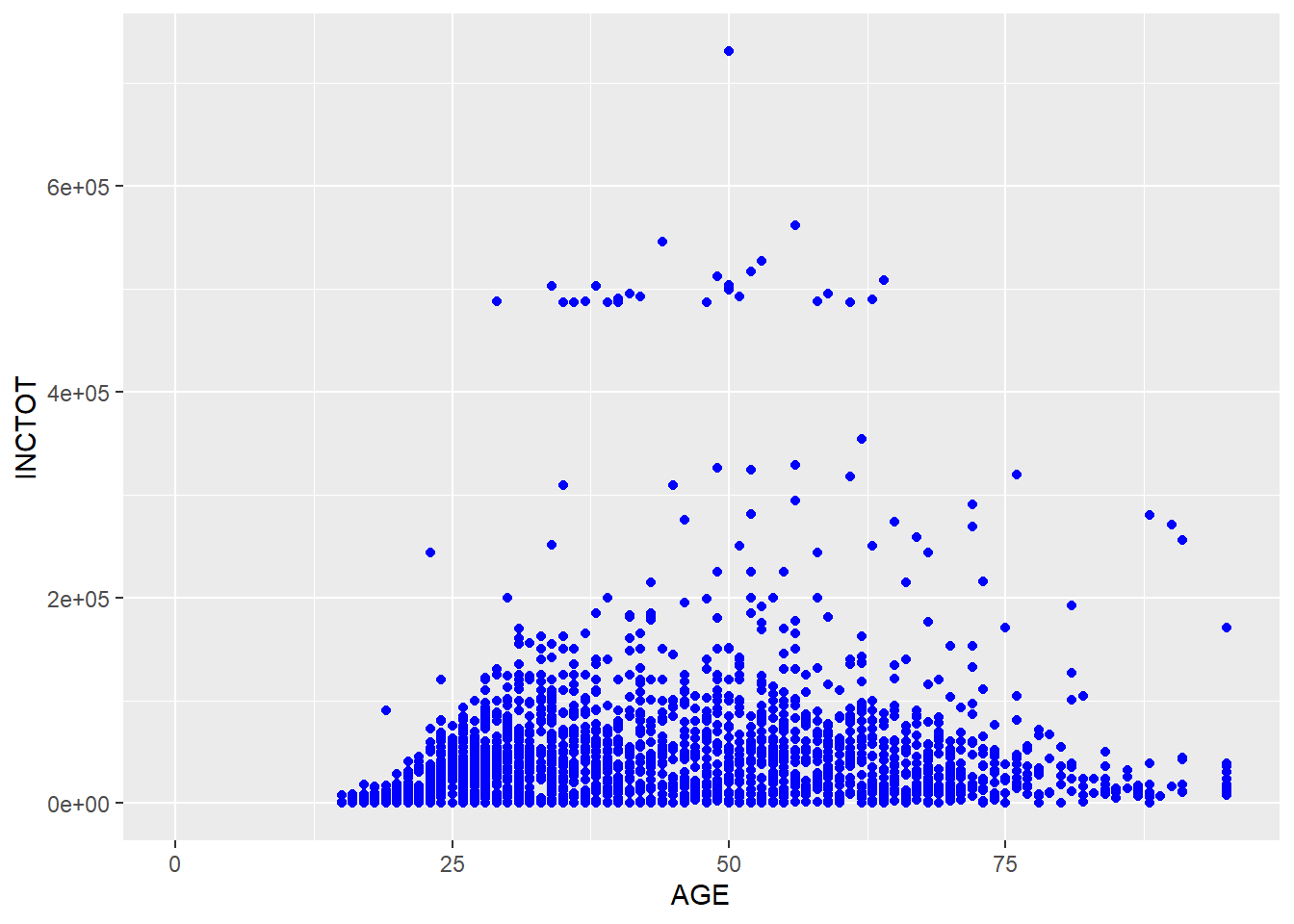
ggplot(minneapolis_2017, aes(AGE, INCTOT)) +
  geom_point(alpha = 0.1)
## Warning: Removed 454 rows containing missing values (geom_point).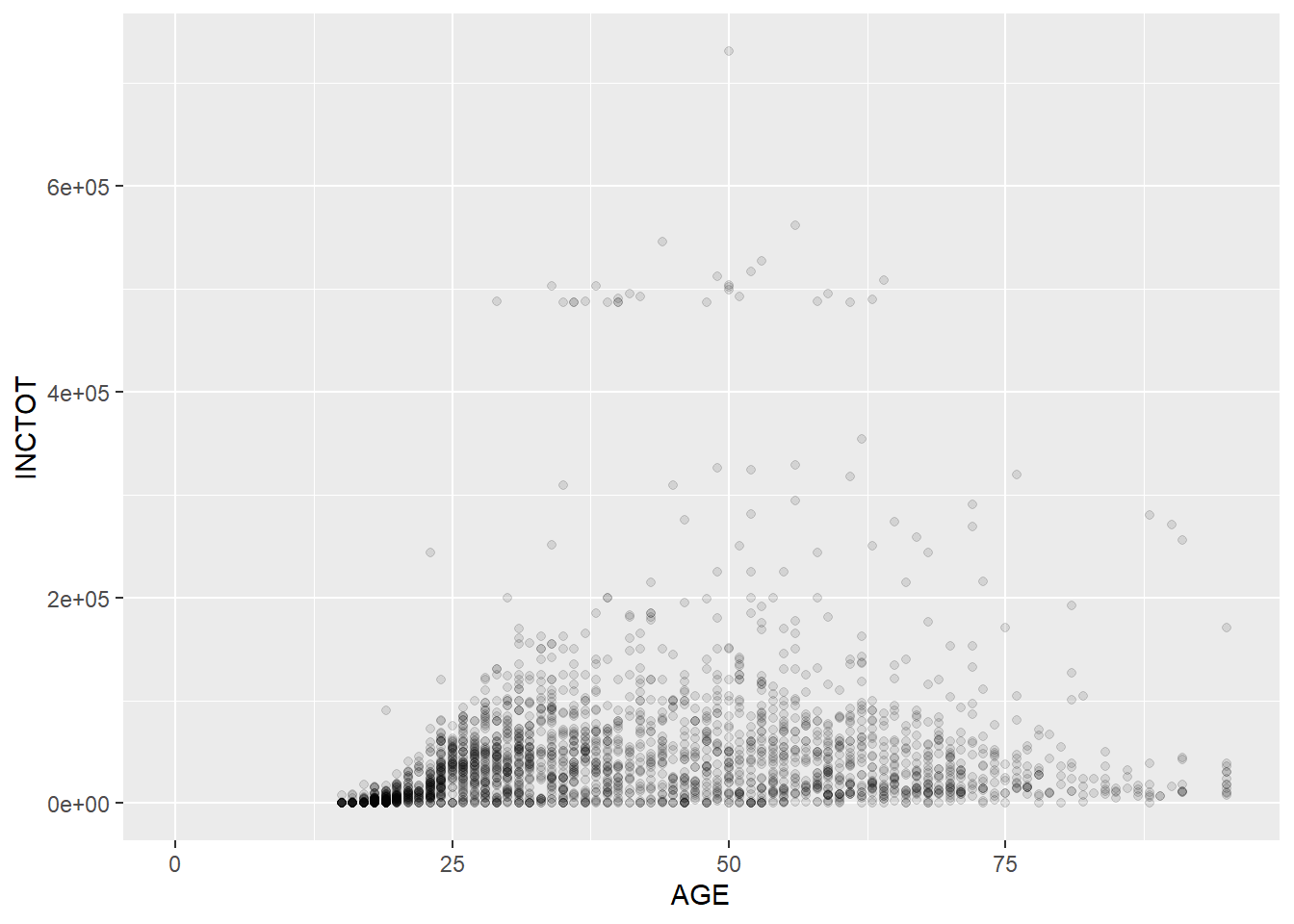
Note that setting the value of alpha helps you recognize the density of the points in scatter plots. The plot above shows that the respondents are more distributed in the younger group.
Geometry has many different types. For examples, geom_point() for scatter plot, geom_bar() for bar plot, geom_boxplot() for box plot, etc. Most functions of geometries are self-explained, so you could tell what their usages easily. We all talk about those commonly used geometries such as scatter plot, bar plot, line plot, etc in the following parts.
7.2.1 Scatter plot
We use geom_point() to plot scatter plot. In the example below, we map AGE to x axis, and INCTOT to y axis. We indicate the color by set col = EDUC. The darkness of each point is decided by its value of EDUC (when the value is larger, the color is lighter).
ggplot(minneapolis_2017, aes(AGE, INCTOT, col = EDUC)) +
  geom_point()
## Warning: Removed 454 rows containing missing values (geom_point).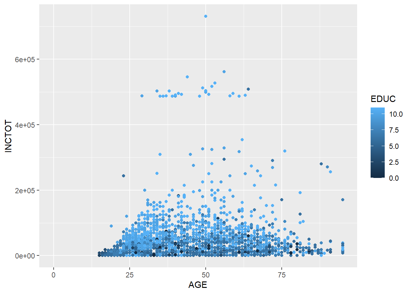
7.2.2 Bar plot
In the example below, we draw a bar plot to show the number of respondents in different racial groups. In aes(), we only indicate the variable RACE by setting x = RACE. R then will count the number of respondents for each racial groups. We, then, use geom_bar() to plot it.
ggplot(minneapolis_2017, aes(x = RACE)) +
  geom_bar()
In the following example, we count the number of respondents in each racial groups firstly. In the next step, we plot the bar plot by setting stat = 'identity' in geom_bar() to tell R to plot a bar plot based on the values directly (without counting).
## count the number of respondents based on RACE
minneaplis_race <- minneapolis_2017 %>%
  group_by(RACE) %>%
  summarise(count = n())

ggplot(minneaplis_race, aes(RACE, count)) +
  geom_bar(stat = 'identity') # you need to specify stat = 'identity' to plot the value for each year
Or you could use another geometry called geom_col() to do it.
ggplot(minneaplis_race, aes(RACE, count)) +
  geom_col()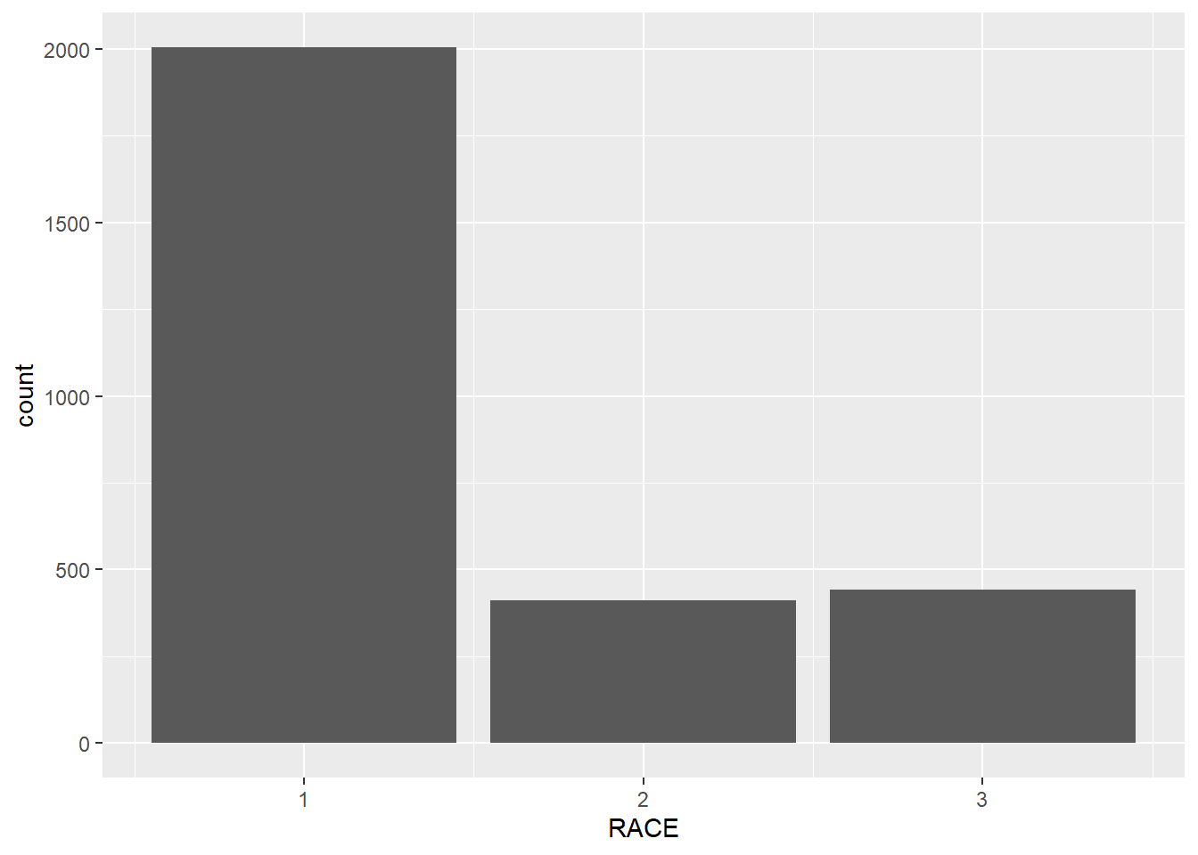
ggplot(minneapolis_2017, aes(x = RACE, fill = factor(SEX))) +
  geom_bar()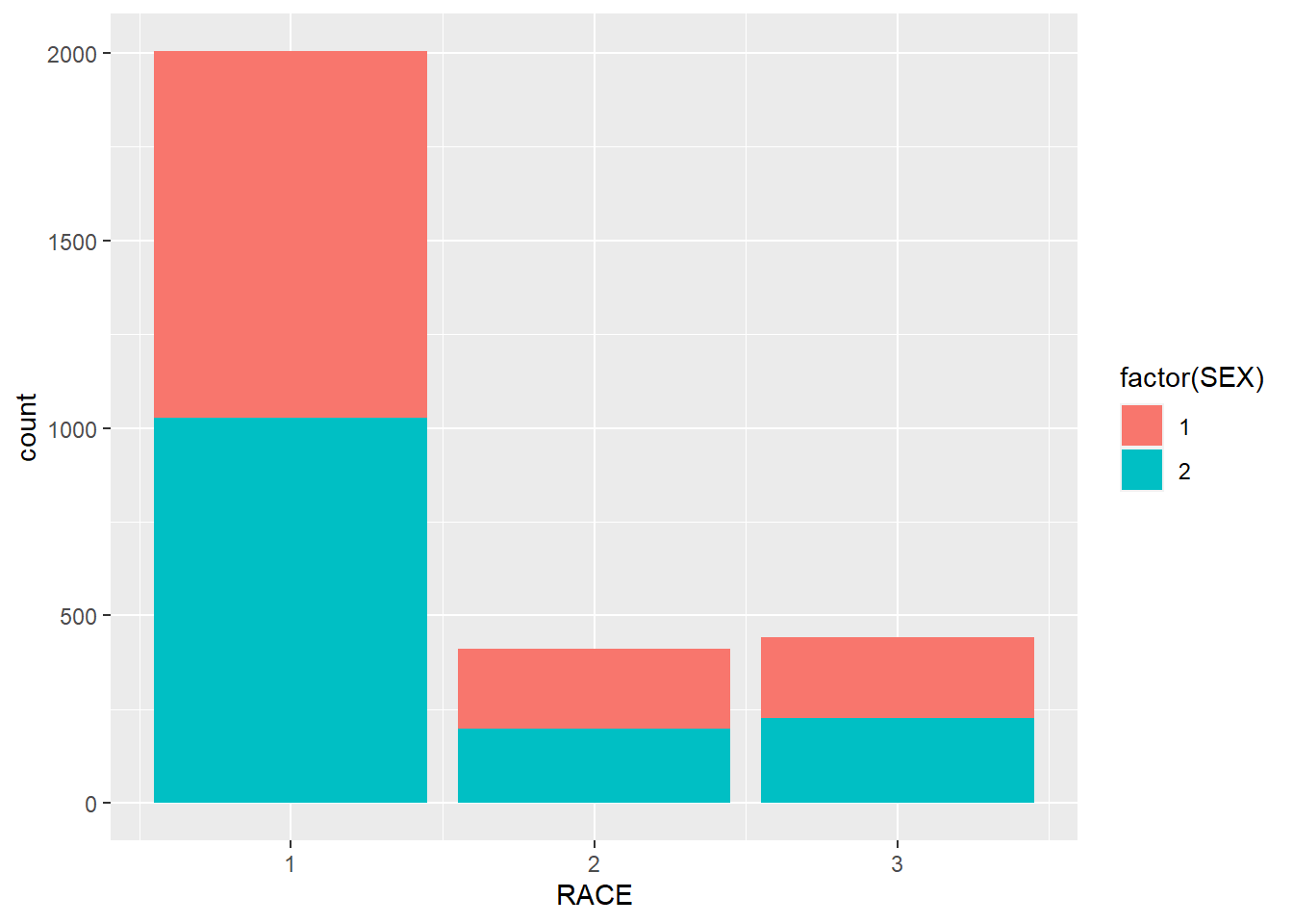
7.2.3 Line plot
In this example, we use geom_line() to draw a line plot.
## calculate the average personal income for each year
minneapolis_year <- minneapolis %>%
  group_by(YEAR) %>%
  summarise(AvgInc = mean(INCTOT, na.rm = T))

## line plot of the trend of average personal income
ggplot(minneapolis_year, aes(YEAR, AvgInc)) +
  geom_line(col = 'Blue') # indicate the color of the line by setting col = 'Blue'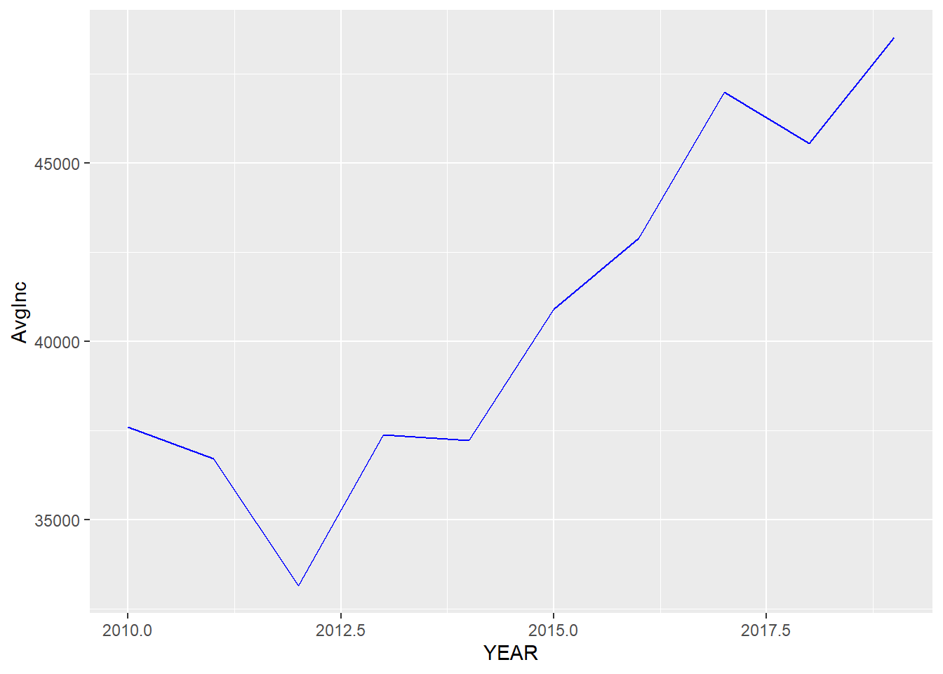
If we map a variable to color in this plot, we will have several lines with different lines indicating different levels in the variable.
## calculate the average personal income for each racial group in each year
minneapolis_year_race <- minneapolis %>%
  group_by(YEAR, RACE) %>%
  summarise(AvgInc = mean(INCTOT, na.rm = T))

## line plot of the trend of average personal income
ggplot(minneapolis_year_race, aes(YEAR, AvgInc, col = factor(RACE))) +
geom_line() 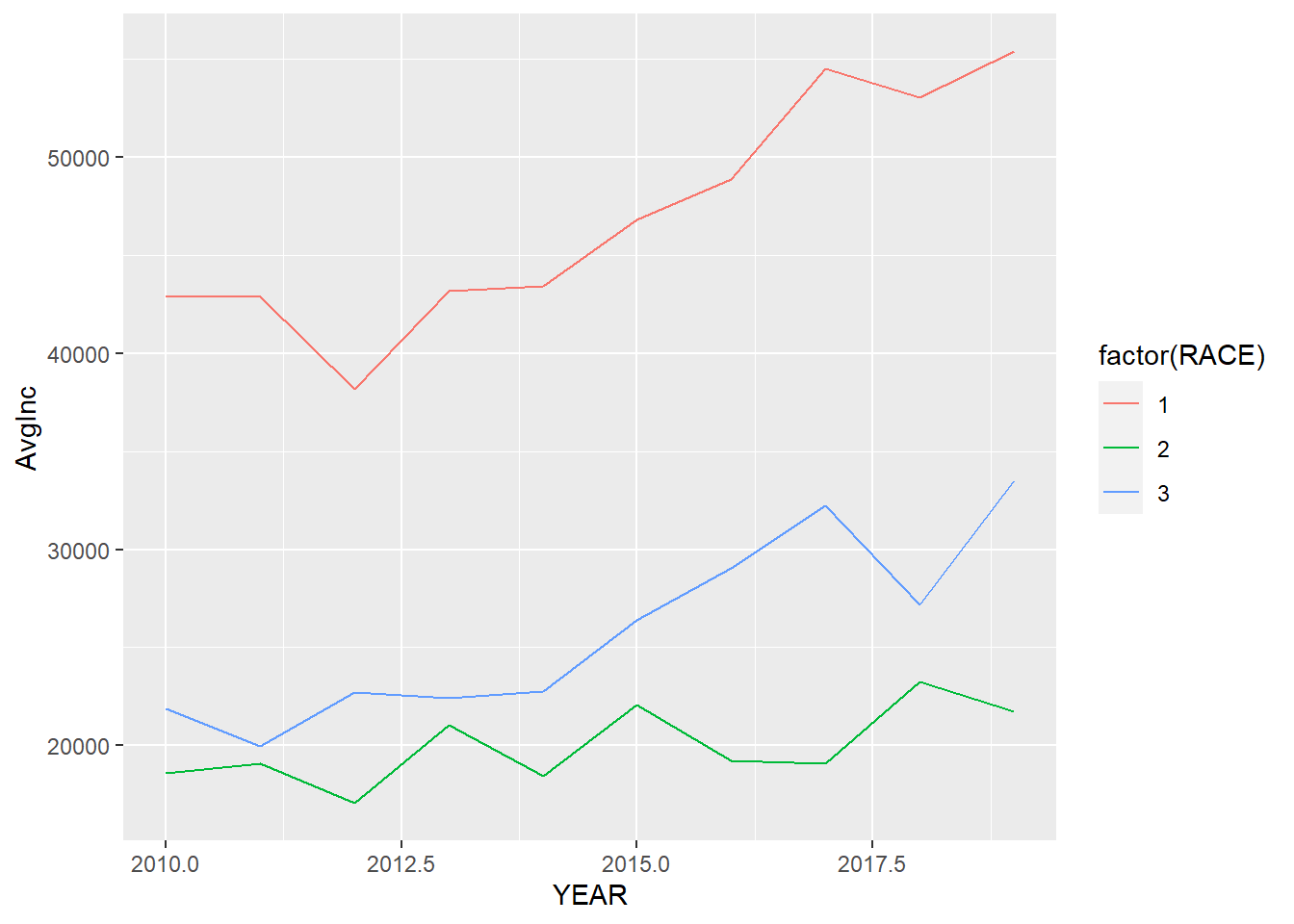
7.2.4 Boxplot
In the example below, we draw a box plot for the personal income in each racial group. To do this, we map RACE to the x axis, and INCTOT to the y axis. We use factor() to transfer RACE to a factor (categorical variable).
ggplot(minneapolis_2017, aes(factor(RACE), INCTOT)) +
  geom_boxplot()
## Warning: Removed 454 rows containing non-finite values (stat_boxplot).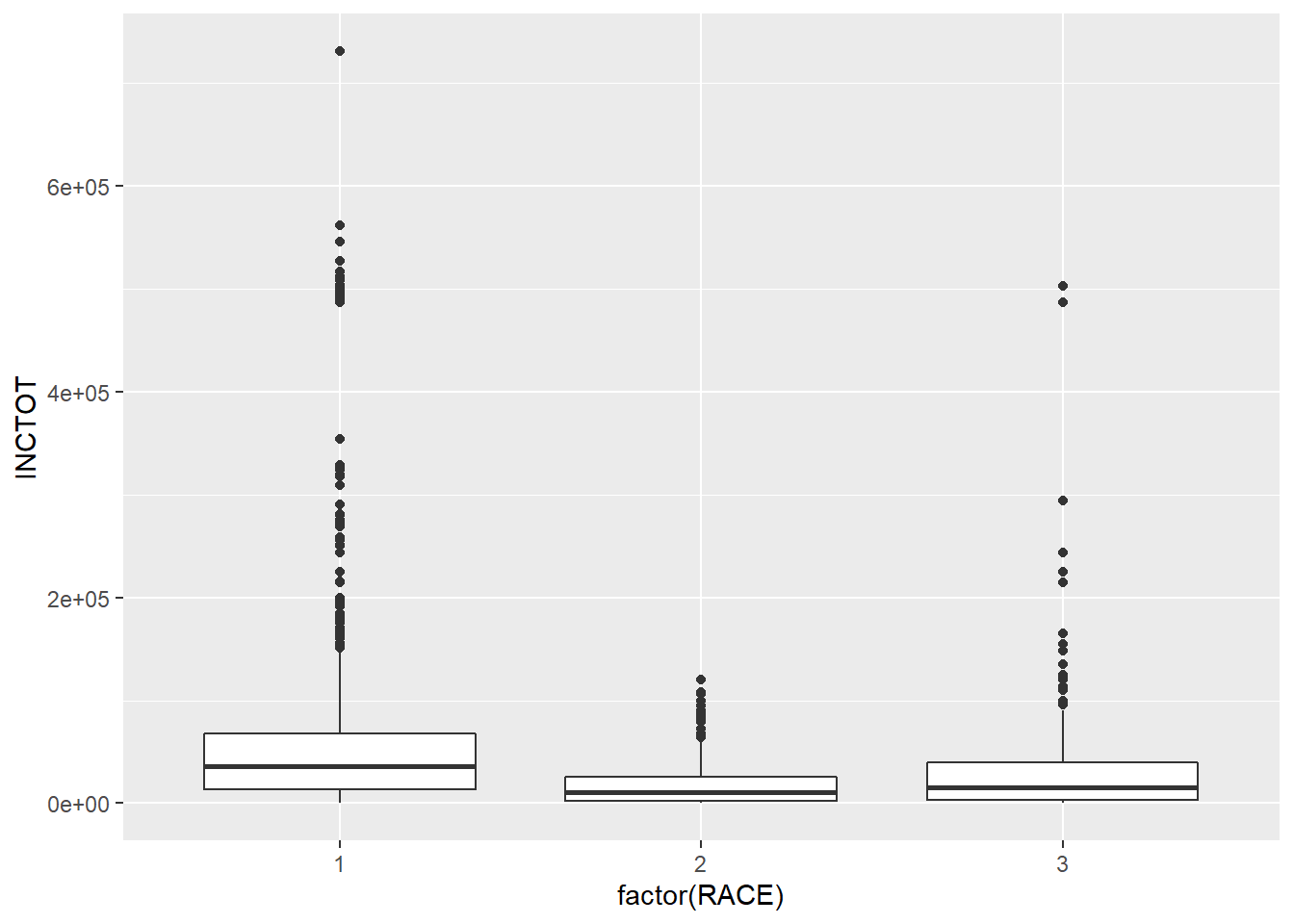
One problem of box plots is that they cannot show the number of observations. For example, you do not have an idea how many points in each racial groups. We could use the geometry of jittering instead. Jittering randomly adds a little noise to the data points to avoid overlapping. The points in the plot below has been added some random noise in the direction of x axis.
ggplot(minneapolis_2017, aes(factor(RACE), INCTOT)) +
  geom_jitter()
## Warning: Removed 454 rows containing missing values (geom_point).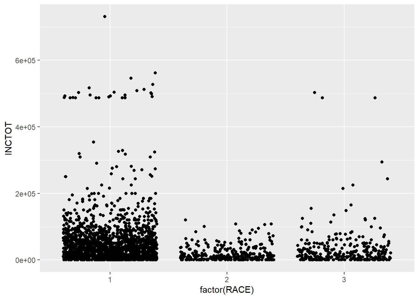
Another geometry is violin plot, which shows the density of the distribution.
ggplot(minneapolis_2017, aes(factor(RACE), INCTOT)) +
  geom_violin()
## Warning: Removed 454 rows containing non-finite values (stat_ydensity).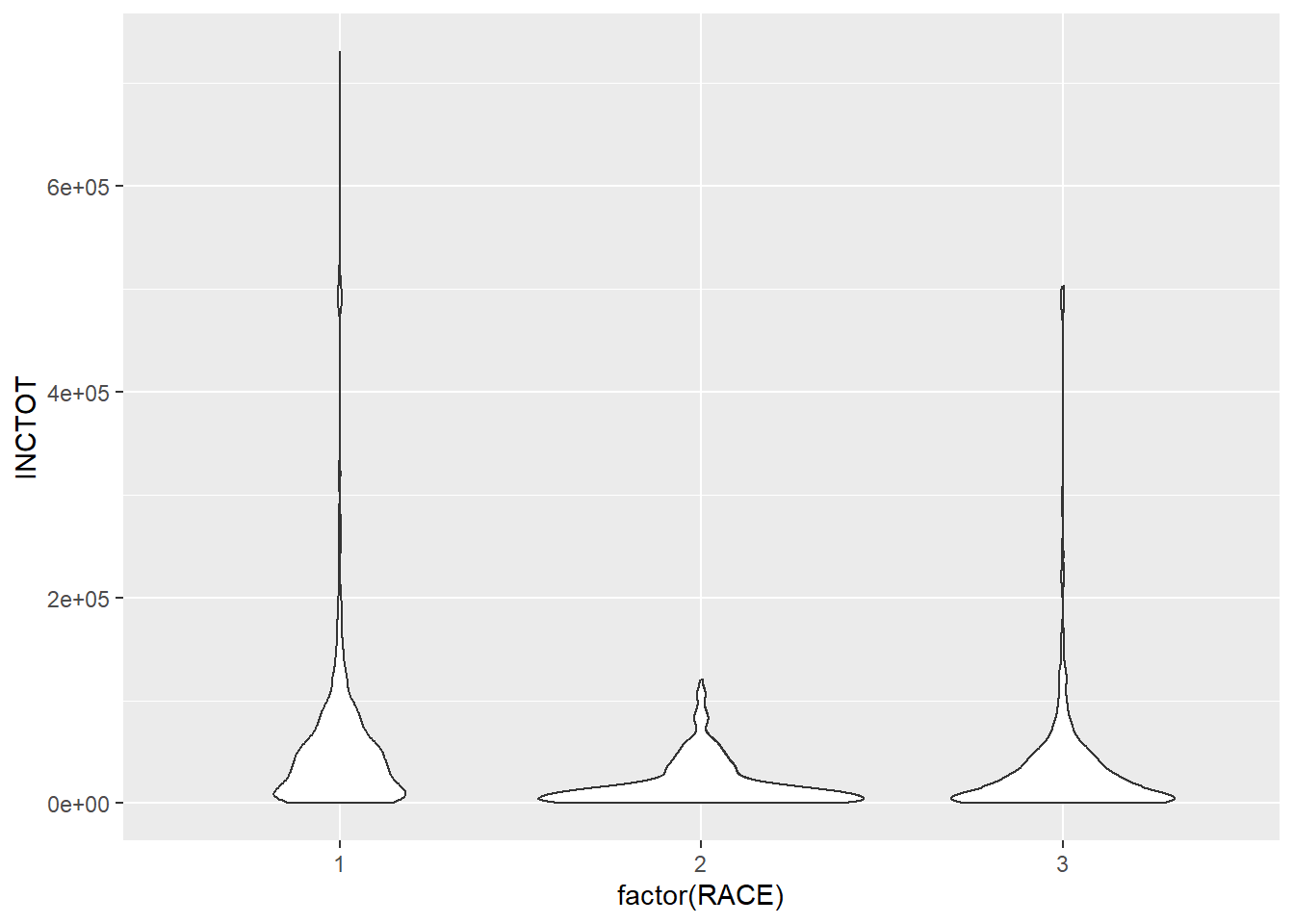
ggplot(minneapolis_2017, aes(factor(RACE), INCTOT, col = factor(SEX))) +
  geom_violin()
## Warning: Removed 454 rows containing non-finite values (stat_ydensity).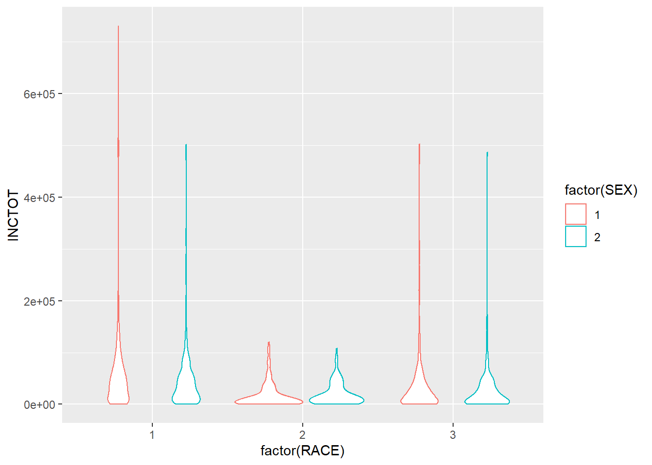
7.2.5 Pie chart
In ggplot2, it is not as intuitive as the base function pie() to draw a pie chart.
ggplot(minneaplis_race, aes('', count, fill = factor(RACE))) +
  geom_bar(width = 1, stat = 'identity') +
  coord_polar('y') # transfer the coordinate system to the polar one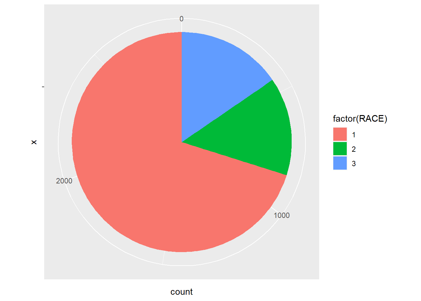
Whatggplot2 does here to draw a pie plot is to create a bar plot first.
ggplot(minneaplis_race, aes('', count, fill = factor(RACE))) +
  geom_bar(width = 1, stat = 'identity')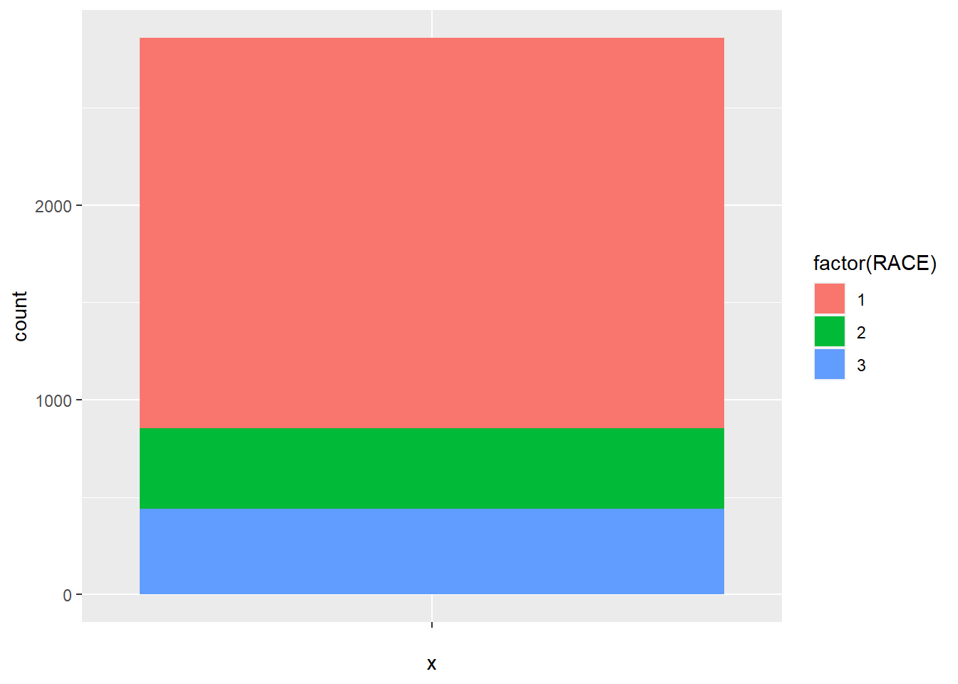
And then transfer the coordinate system to the polar one.
ggplot(minneaplis_race, aes('', count, fill = factor(RACE))) +
  geom_bar(width = 1, stat = 'identity') +
  coord_polar('y')
7.3 Facets
If you want to split up your data by one or more variables and plot each subset in one figure, facet is the element you want to use.
In the following example, we draw a scatter plot for each racial group. In each plot, we map AGE to the x axis and INCTOT to y axis. The three plots are aligned in a row.
p <- ggplot(minneapolis_2017, aes(AGE, INCTOT)) +# store the plot result in variable p
  geom_point()

p + facet_grid(. ~ RACE) # Facets, for each racial group
## Warning: Removed 454 rows containing missing values (geom_point).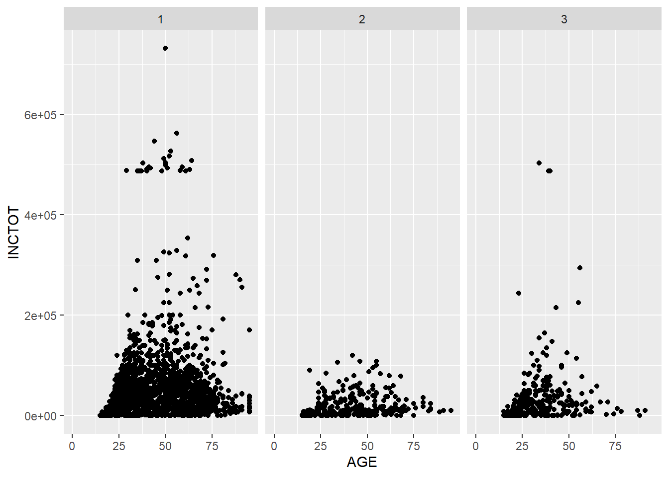
If we want to align the plots in a column, exchange the position of the variable in the function.
p + facet_grid(RACE ~ .) # Facets, pay attention to the position of RACE and the dot sign## Warning: Removed 454 rows containing missing values (geom_point).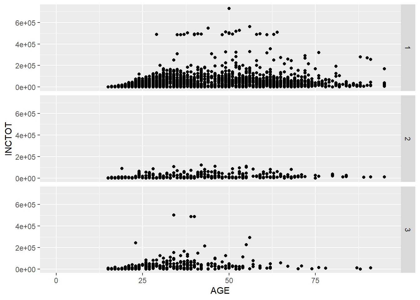
We could put more variables to split the plots. In the following example, we put one more variable SEX in the facet_grid().
p + facet_grid(SEX ~ RACE) # add vs## Warning: Removed 454 rows containing missing values (geom_point).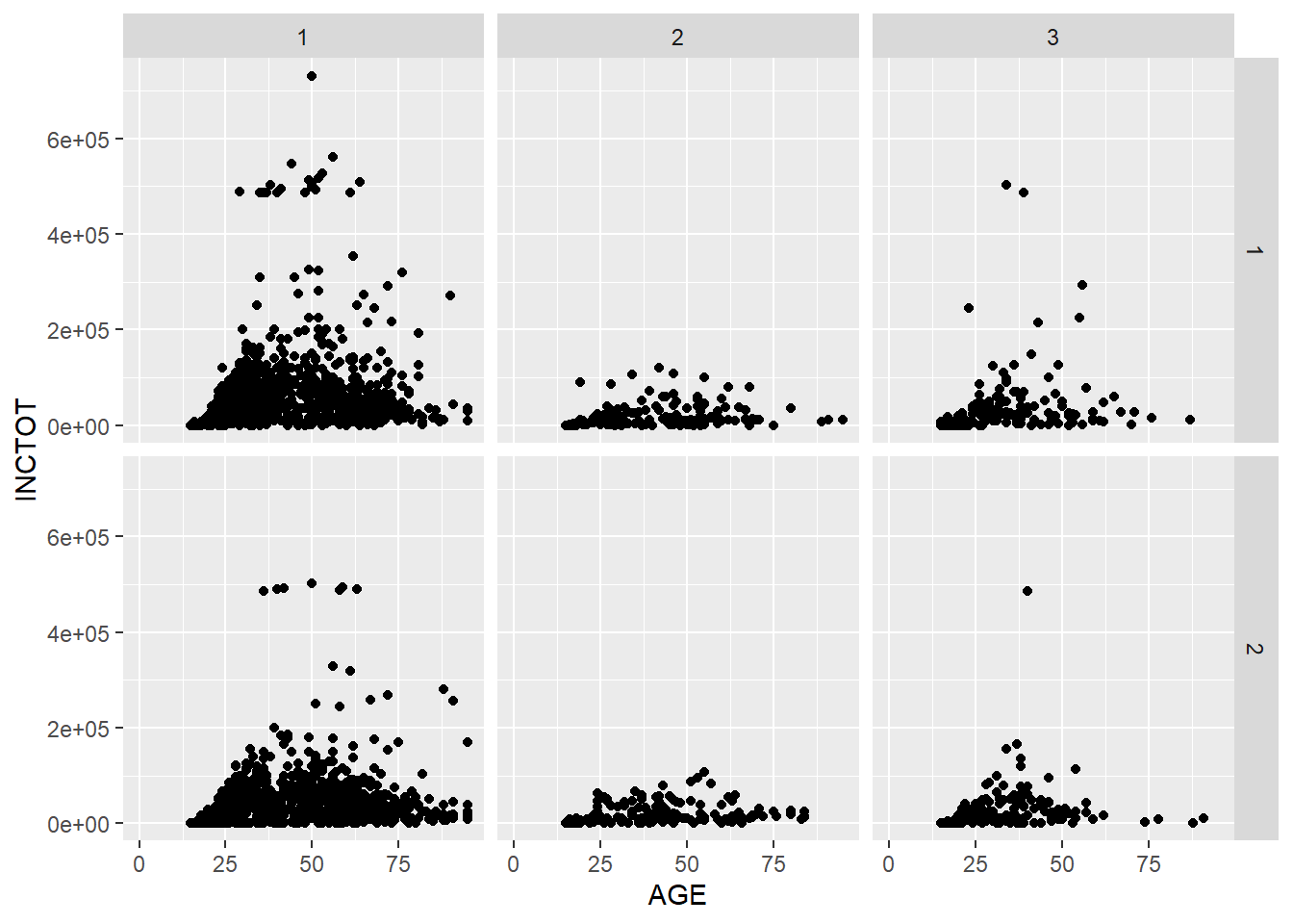
We could use the margins = T to add more plots showing the aggregation of the plots in each column or row.
p + facet_grid(SEX ~ RACE, margins = T) # add aggregation plots for each row and column## Warning: Removed 1816 rows containing missing values (geom_point).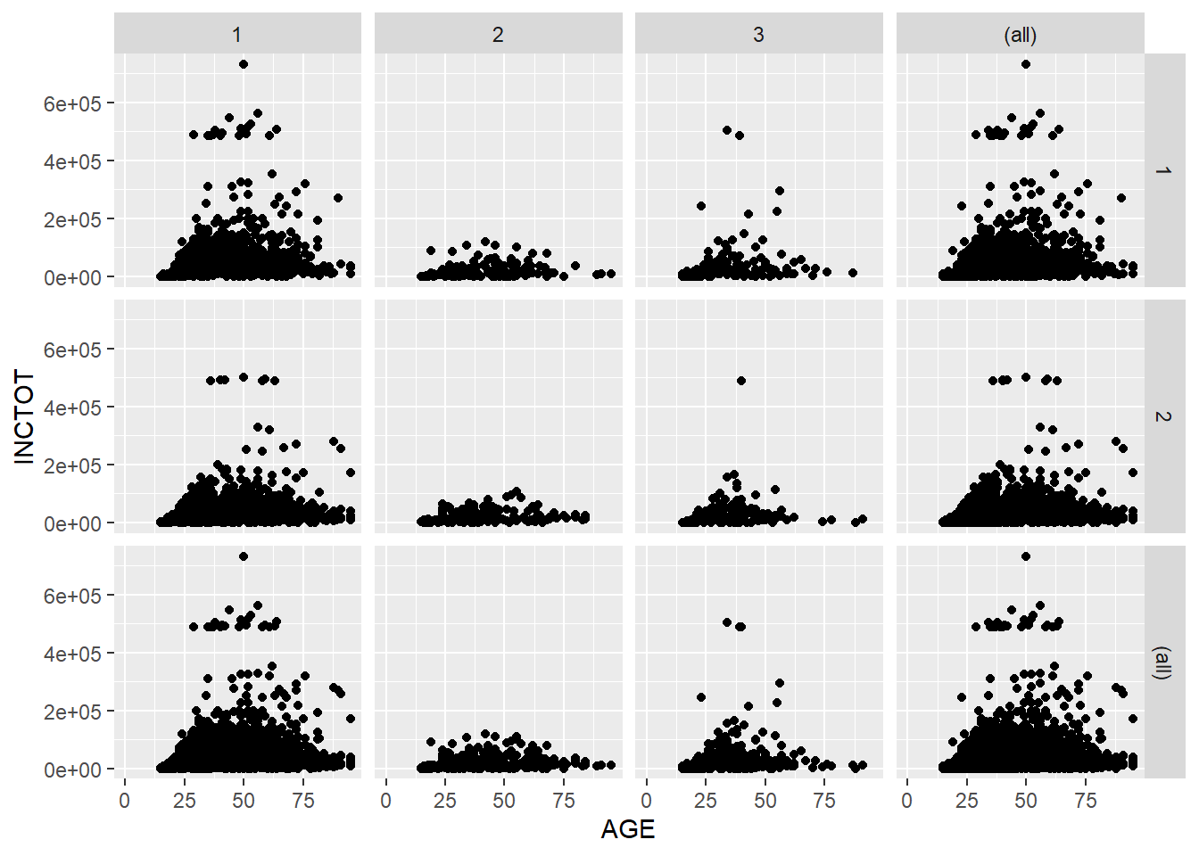
We could use labeller = label_both to add more information in the label.
p + facet_grid(SEX ~ RACE, labeller = label_both) # add more info in the label## Warning: Removed 454 rows containing missing values (geom_point).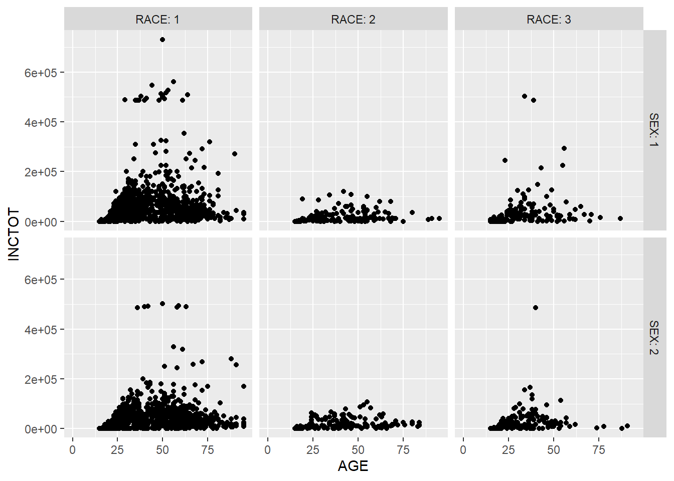
With facet_wrap(), we can spread the subplots evenly in the screen space.
ggplot(minneapolis_2017, aes(AGE, INCTOT)) +
  geom_point() +
  facet_wrap(~EDUC)
## Warning: Removed 454 rows containing missing values (geom_point).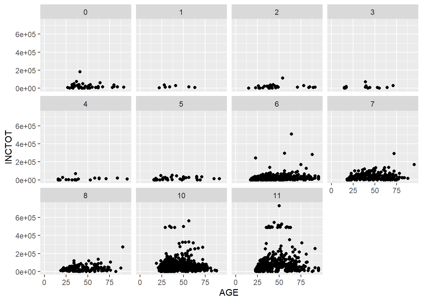
Based on the plot, we have three observations. The first is the relationship between age and personal income. The second is that personal income grows as education level increases. The final one is that there are more respondents with higher education level in the survey than those with lower education level.
7.4 Coordinates
While there are many coordinate systems supported by ggplot2, the most commonly used is Cartesian coordinate system, which is the combination of x axis and y axis orthogonally.
7.4.1 Zooming in and out
In the following example, we zoom in our plot to a specific area.
p <- ggplot(minneapolis_2017, aes(AGE, INCTOT)) +
      geom_point()
p + coord_cartesian(xlim = c(16, 100), ylim = c(0,20000))
## Warning: Removed 454 rows containing missing values (geom_point).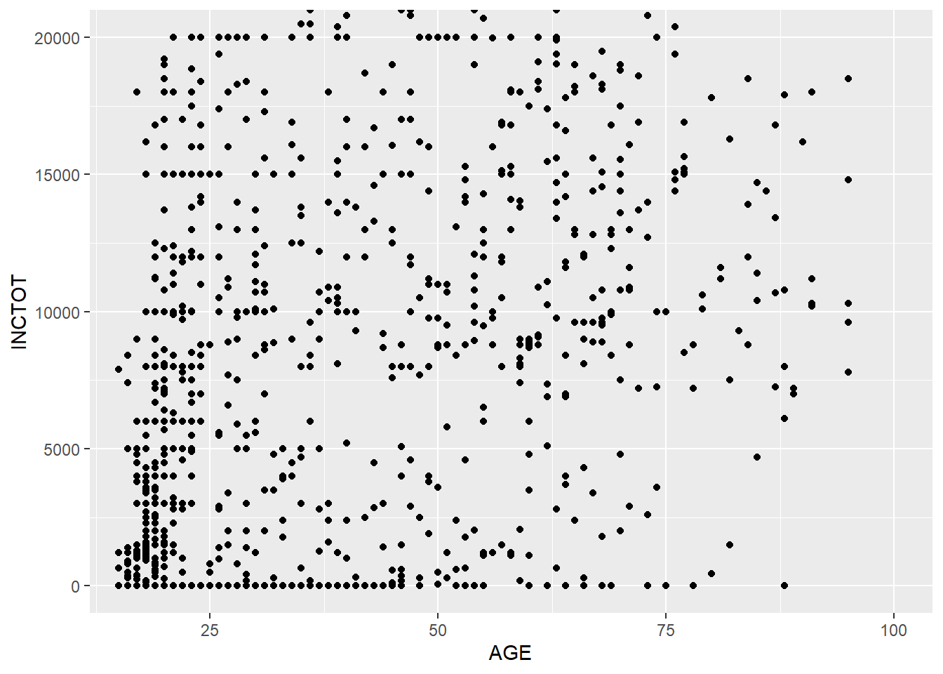
7.4.2 Ratio
We could change the ratio of the length of a y unit relative to the length of a x unit (\(\frac{\text{y unit}}{\text{x unit}}\)).
p <- ggplot(minneapolis_2017, aes(AGE, EDUC)) +
  geom_point()
p +  coord_fixed(ratio = 1) ## 1 mean the units are same in x and y axis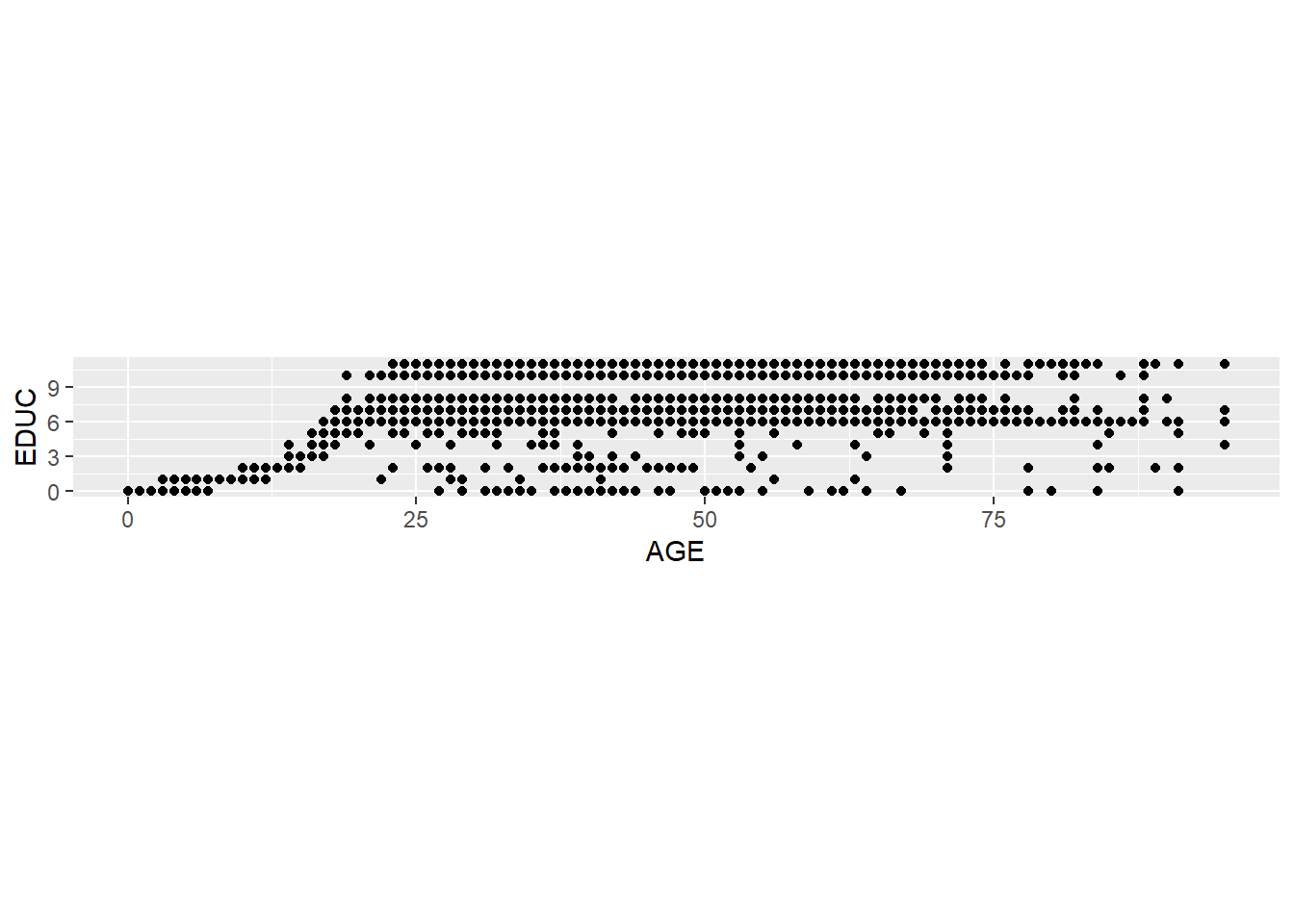
p + coord_fixed(ratio = 5)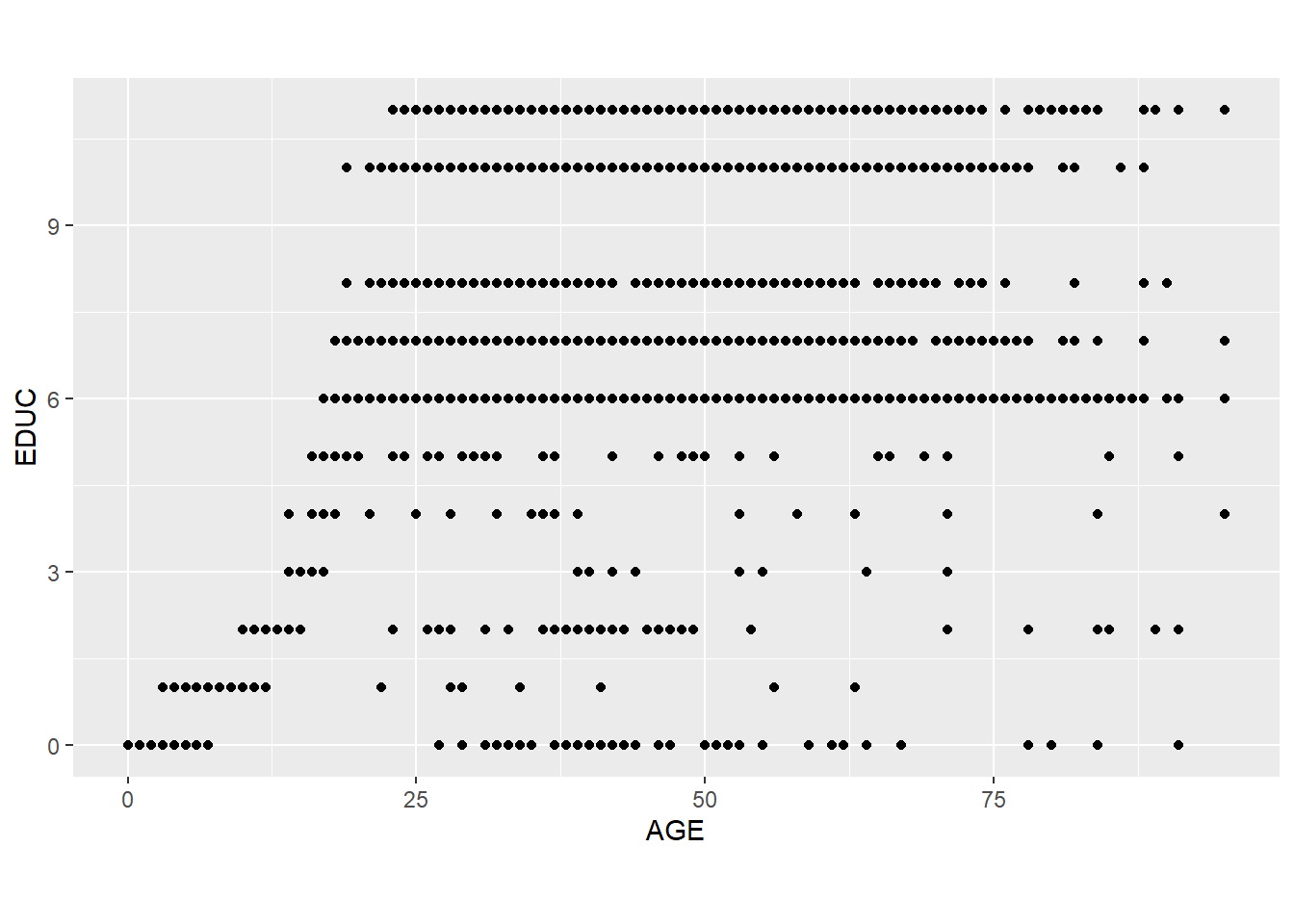
7.4.3 Swaping the axes
p + coord_flip()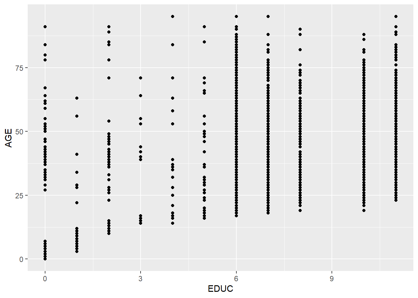
ggplot(minneapolis_2017, aes(factor(SEX), INCTOT)) +
  geom_boxplot() +
  coord_flip()
## Warning: Removed 454 rows containing non-finite values (stat_boxplot).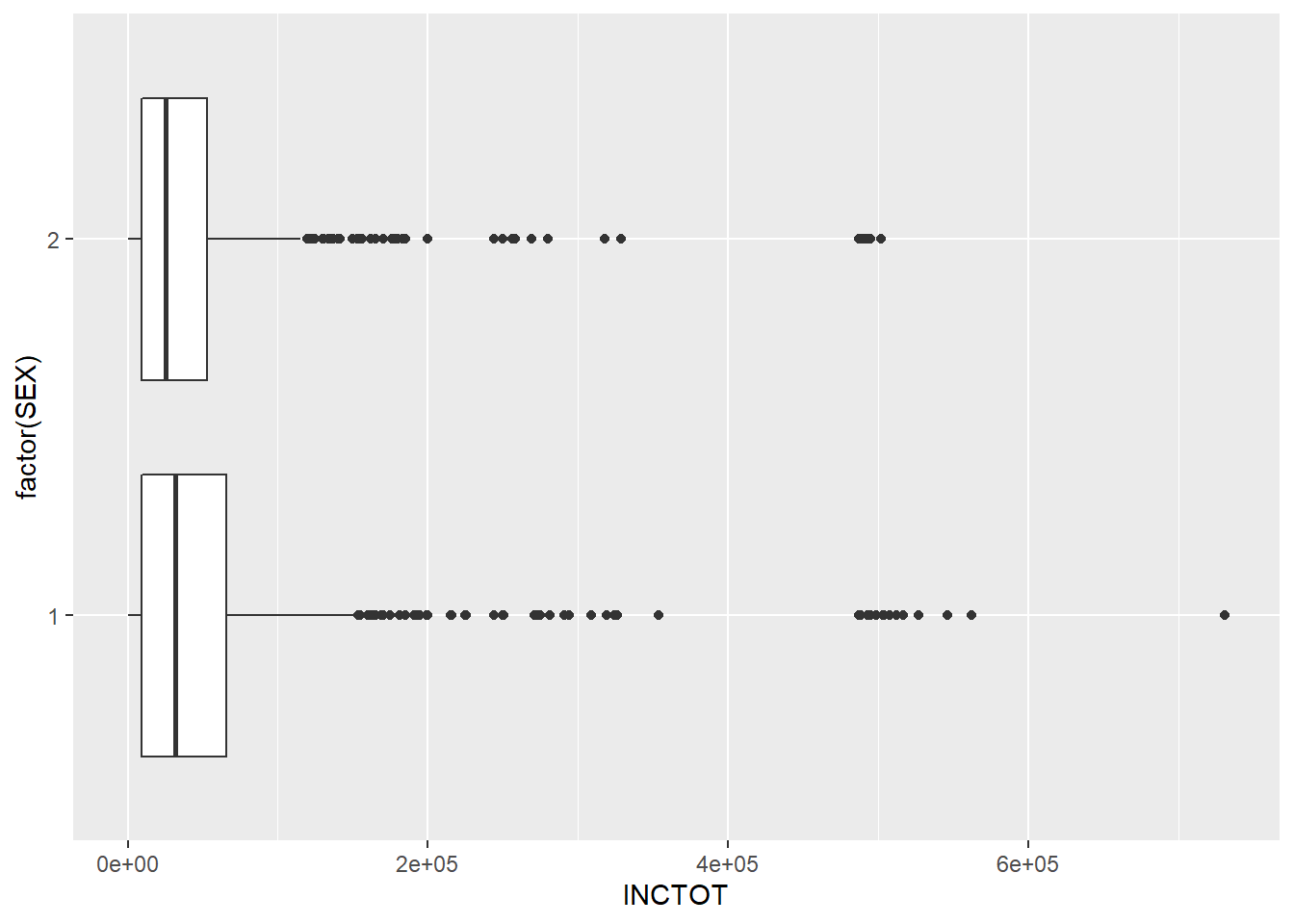
ggplot(minneapolis_2017, aes(x = RACE)) +
  geom_bar() +
  scale_y_reverse()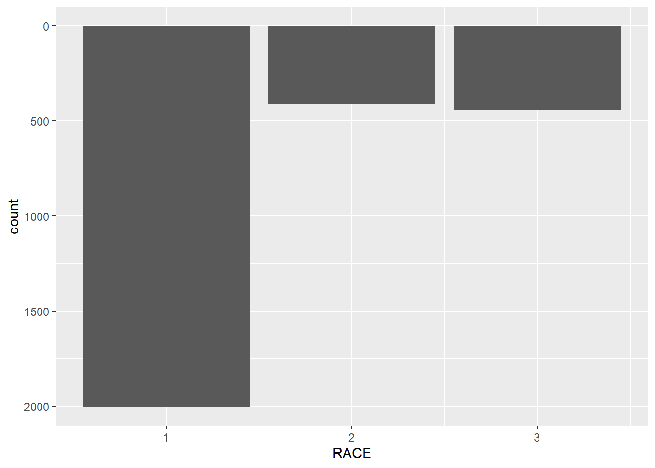
7.4.4 Polar coordinate system
We touched the polar coordinate system a little bit when drawing a pie chart.
ggplot(minneapolis_2017, aes(x = '', fill = factor(EDUC))) +
  geom_bar(width = 1) +
  coord_polar(theta = 'y')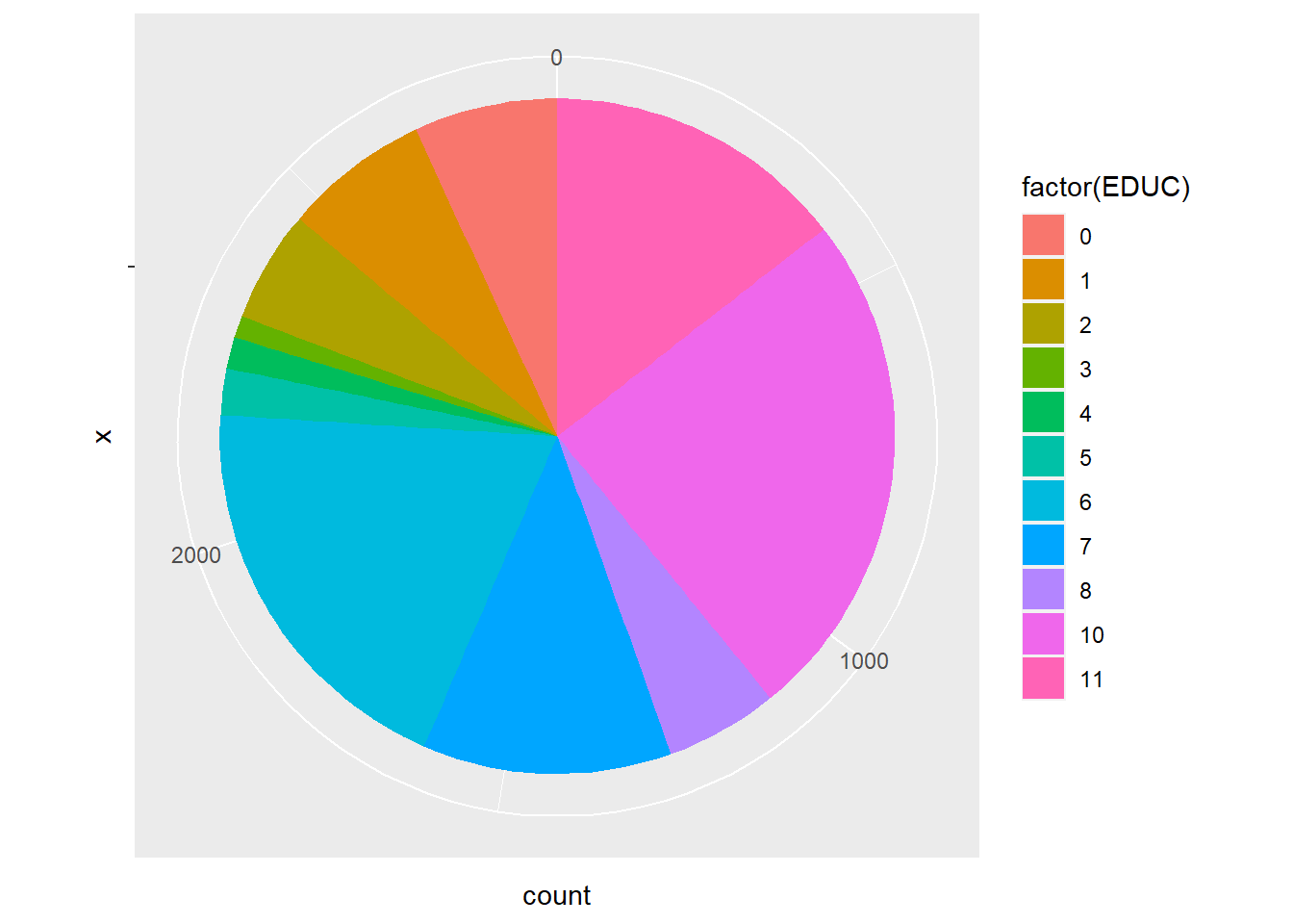
We could do this in a different way.
ggplot(minneapolis_2017, aes(x = factor(EDUC))) +
  geom_bar(width = 1, col = 'Black', fill = 'Grey') +
  coord_polar()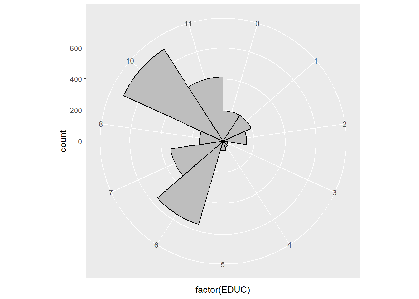
7.5 Themes
ggplot2 is powerful in its flexibility of themes.
7.5.1 Add labels
Add labels with labs() function.
p <- ggplot(minneapolis_2017, aes(AGE, INCTOT)) +
  geom_point() +
  geom_smooth(method = 'loess')
p + labs(title = 'Age and personal income in Minneapolis (2017)', # title of the plot
         subtitle = 'Data source: American Community Survey', # sub title
         x = 'Age', # x label
         y = 'Personal income (dollars)') # y label
## Warning: Removed 454 rows containing non-finite values (stat_smooth).## Warning: Removed 454 rows containing missing values (geom_point).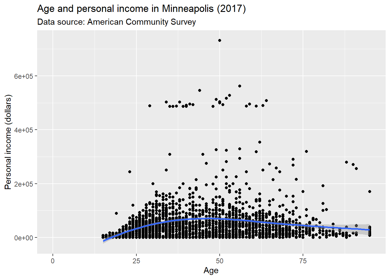
Or use ggtitle(), xlab(), and ylab() instead.
p + ggtitle('Age and personal income in Minneapolis (2017)') + # title
  xlab('Age') + # x label
  ylab('Personal income (dollars)') # y label
## Warning: Removed 454 rows containing non-finite values (stat_smooth).## Warning: Removed 454 rows containing missing values (geom_point).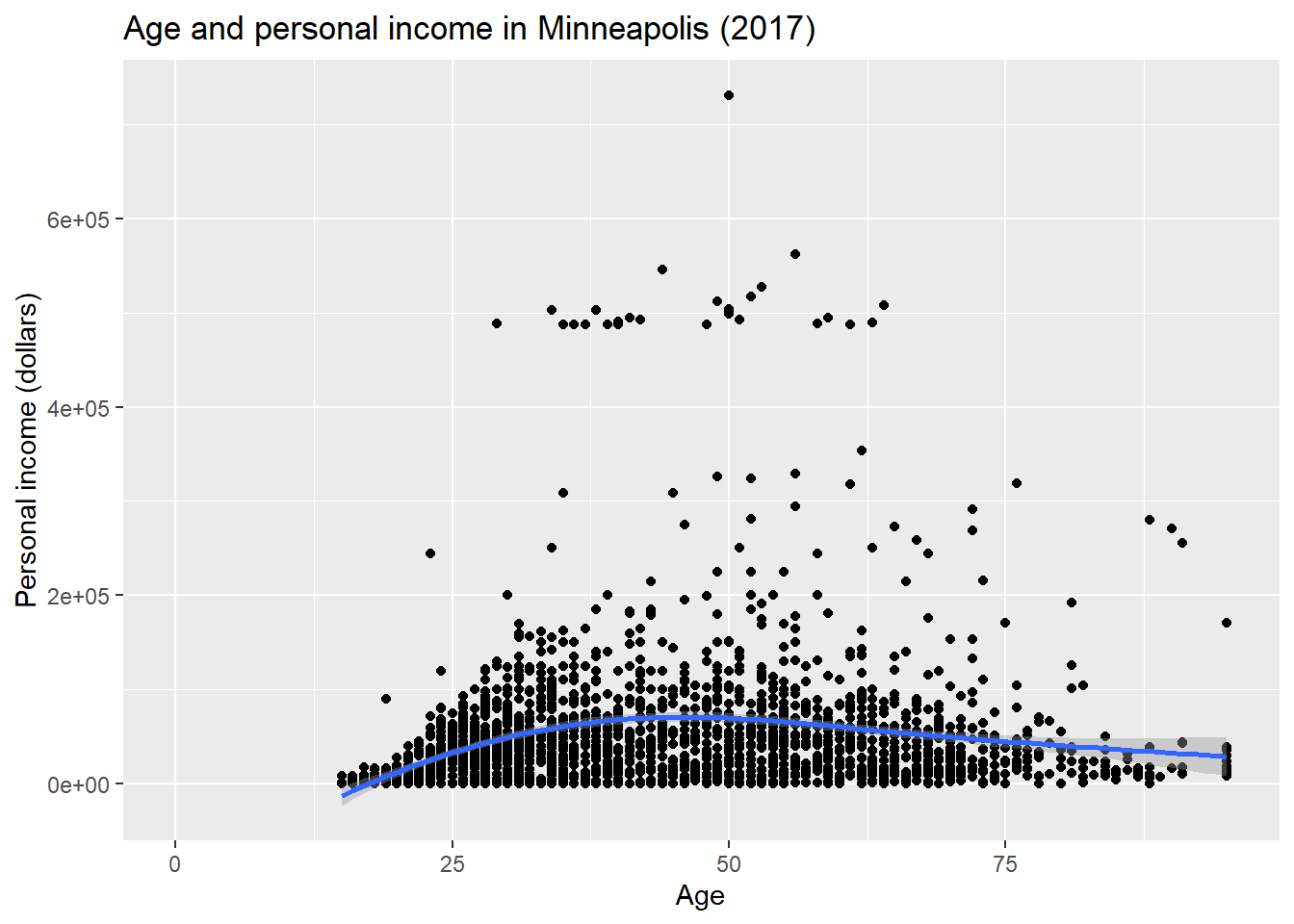
With value of NULL to remove labels.
p +
  xlab(NULL) + # x label
  ylab(NULL) # y label
## Warning: Removed 454 rows containing non-finite values (stat_smooth).## Warning: Removed 454 rows containing missing values (geom_point).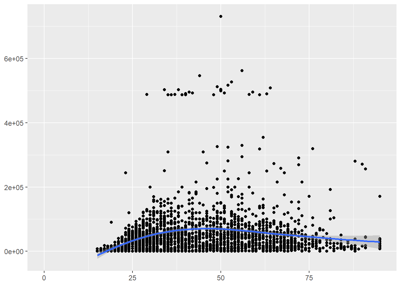
7.5.2 Change ticks
Here is an example of changing the ticks for a discrete variable.
p <- ggplot(minneapolis_2017, aes(factor(SEX), INCTOT))
p + geom_boxplot() +
    scale_x_discrete(name = "Gender", # name of the x axis
                    labels = c('Male', 'Female')) # change 1 and 2 to Male and Female
## Warning: Removed 454 rows containing non-finite values (stat_boxplot).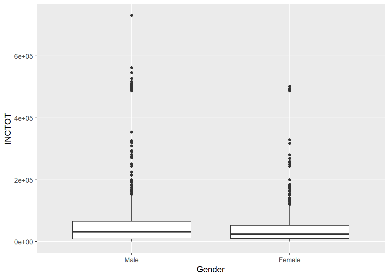
ggplot(minneapolis_year, aes(YEAR, AvgInc)) +
  geom_line(col = 'Blue') +
  scale_x_continuous(breaks = c(2010:2019))  +
  scale_y_continuous(breaks = seq(30000, 50000, 2500))## set the ticks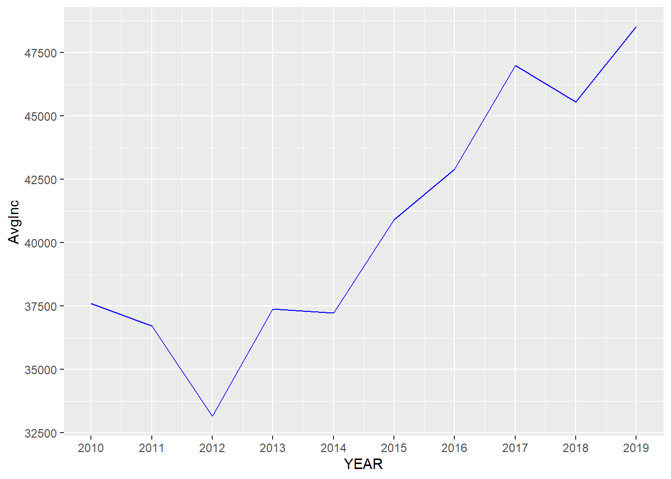
7.5.3 theme() function
theme() function could change the styles of all components of plots. Here are a few examples about it (ggplot2 2019).
p <- ggplot(minneapolis_2017, aes(AGE, INCTOT)) +
  geom_point() +
  labs(title = 'Age and personal income in Minneapolis (2017)',
         subtitle = 'Data source: American Community Survey',
         x = 'Age',
         y = 'Personal income (dollars)')

p # original plot
## Warning: Removed 454 rows containing missing values (geom_point).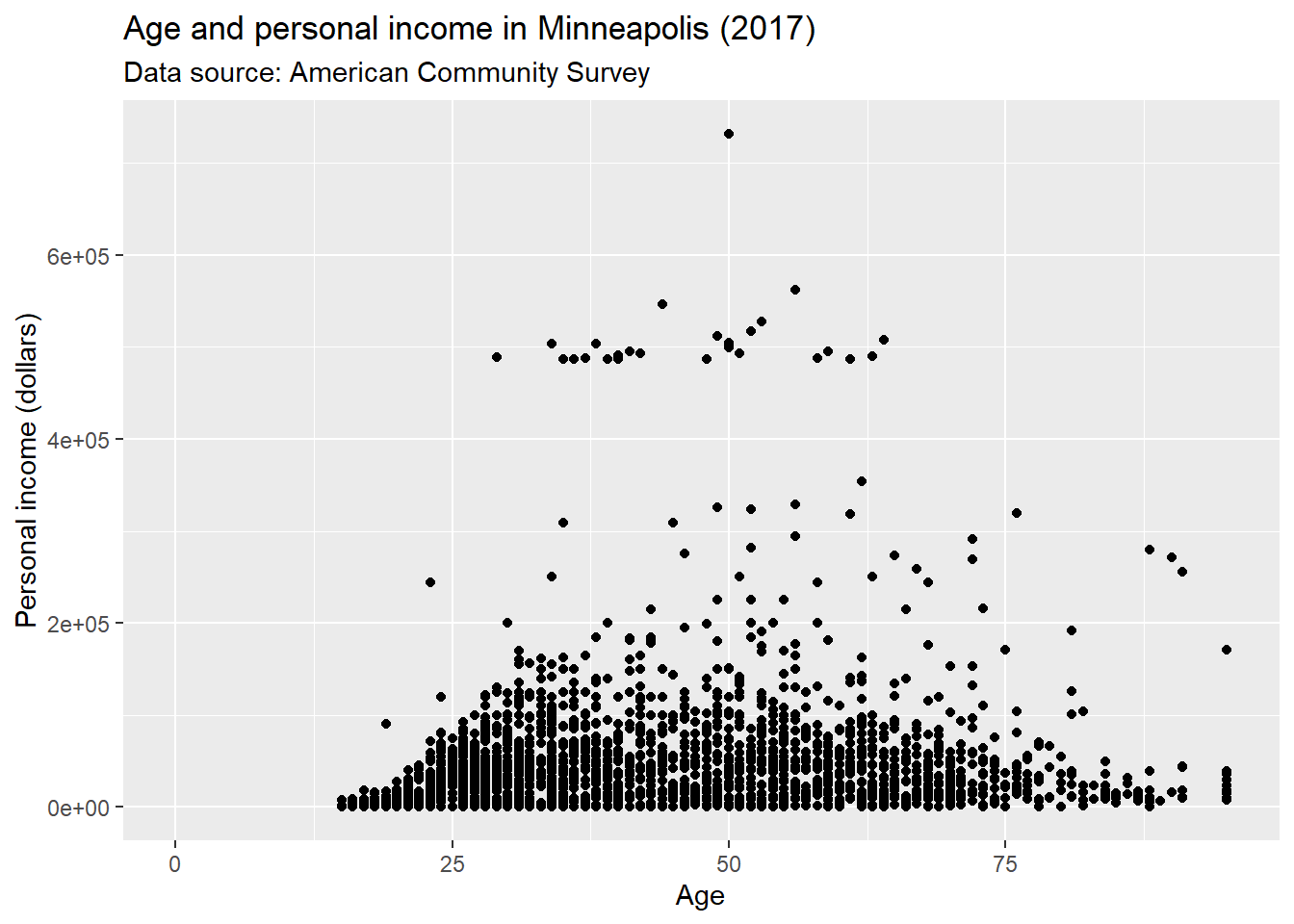
We could use plot.title to change the style of a title in the plot. In the following example, we change the font size of the title by setting element_text() and making size to be twice larger as the default one.
p + theme(plot.title = element_text(size = rel(2)))## Warning: Removed 454 rows containing missing values (geom_point).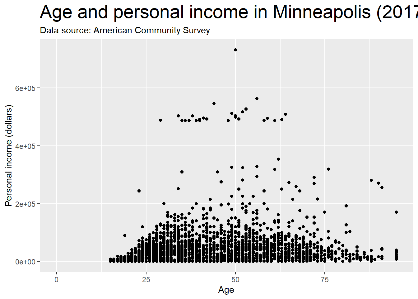
We could also use absolute value to indicate the size directly.
p + theme(plot.title = element_text(size = 15))## Warning: Removed 454 rows containing missing values (geom_point).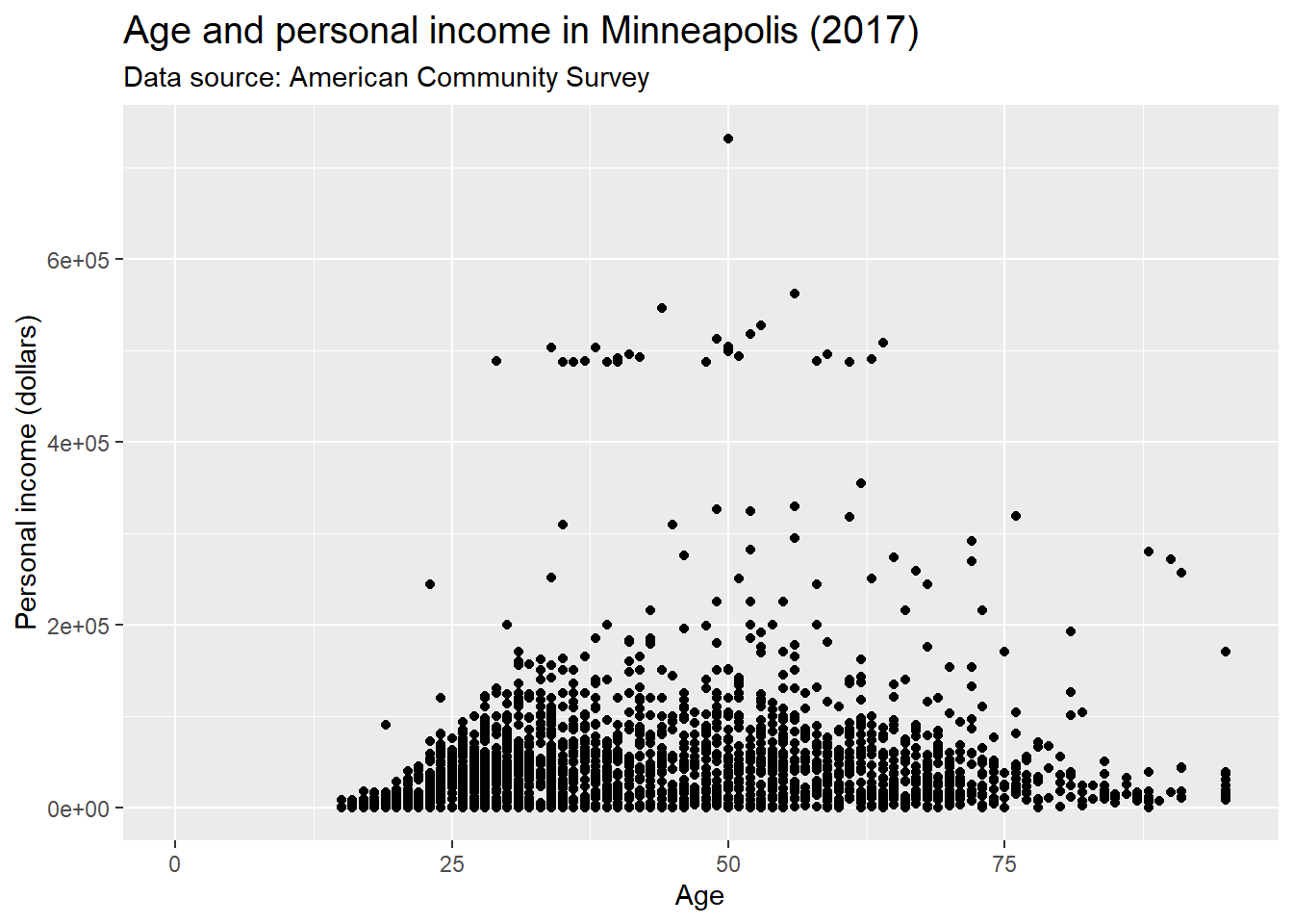
We could change the background of the plot by setting the value of plot.background in the theme() function. For example, if we want to change the color, we could set element_rect() and fill = 'red'.
p + theme(plot.background = element_rect(fill = 'red'))## Warning: Removed 454 rows containing missing values (geom_point).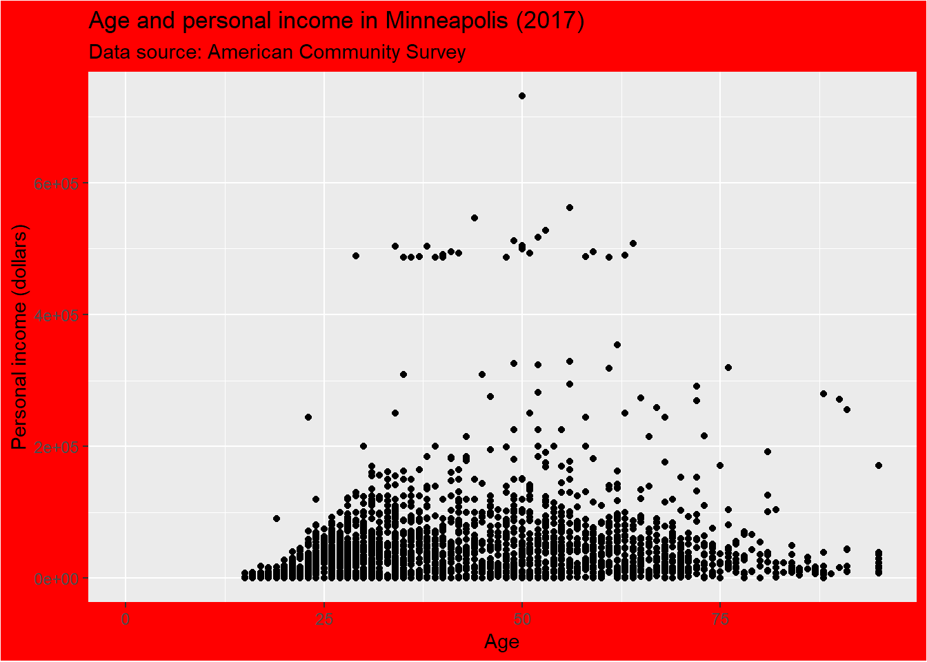
More specifically, if we want to change the style of the panel, which is the inner part restricted by x and y axes, we could set the value of panel.background.
p + theme(panel.background = element_rect(fill = 'green', color = 'red'))## Warning: Removed 454 rows containing missing values (geom_point).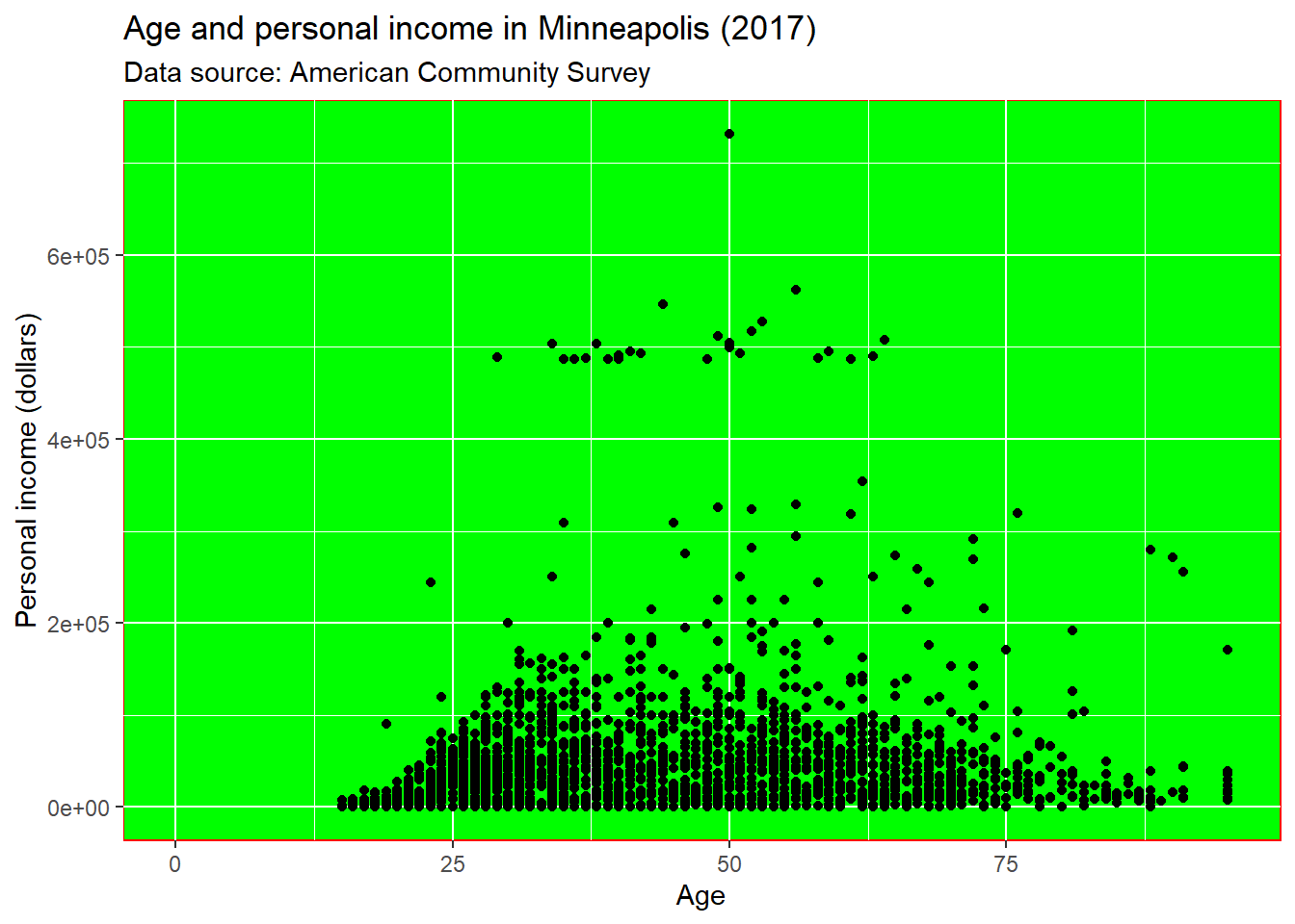
We could set the line type of the panel’s border.
p + theme(panel.border = element_rect(linetype = 'dashed', fill = NA))## Warning: Removed 454 rows containing missing values (geom_point).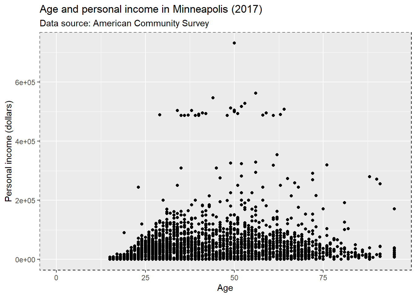
Change the attributes of the lines for the grid. element_line() stands for the attributes of the lines.
p + theme(panel.grid.major = element_line(colour = 'black'),
          panel.grid.minor = element_line(colour = 'blue'))
## Warning: Removed 454 rows containing missing values (geom_point).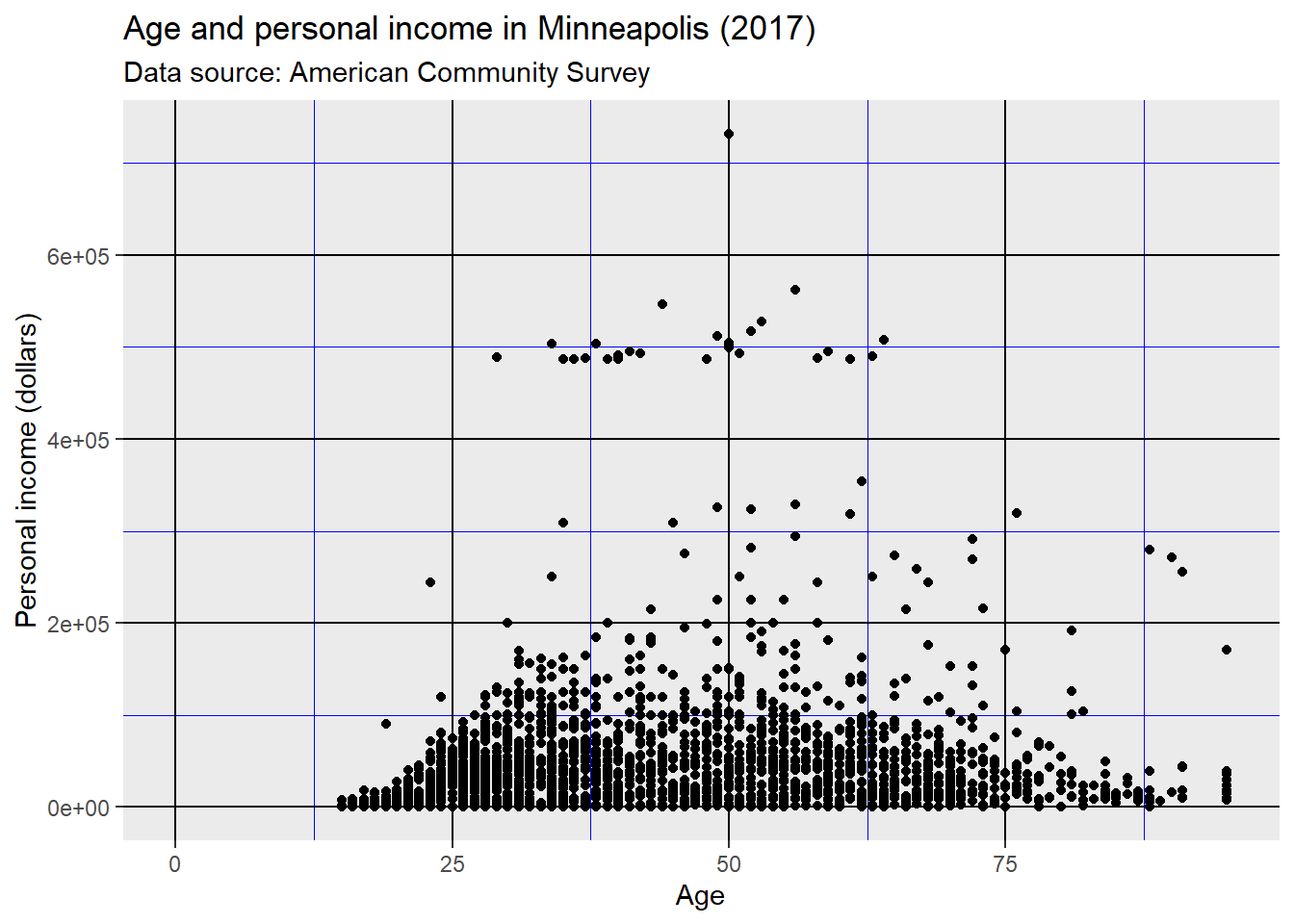
Use element_blank() to remove the themes of the target.
p + theme(panel.grid.major.y = element_blank(),
          panel.grid.minor.y = element_blank())
## Warning: Removed 454 rows containing missing values (geom_point).
We could put the grid line on the top of our data by setting panel.ontop = TRUE.
p + theme(
  panel.background = element_rect(fill = NA),
  panel.grid.major = element_line(colour = 'Blue'),
  panel.ontop = TRUE
)
## Warning: Removed 454 rows containing missing values (geom_point).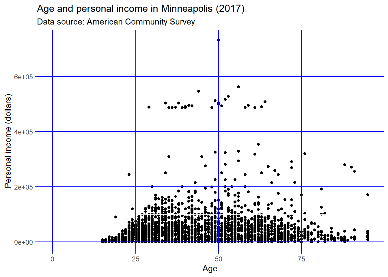
Change the line style of the axis.
p + theme(
  axis.line = element_line(size = 2, colour = 'red')
)
## Warning: Removed 454 rows containing missing values (geom_point).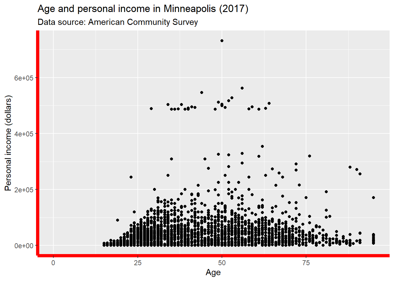
Change the text style of the axis.
p + theme(
  axis.text = element_text(colour = 'Green', size = 15)
)
## Warning: Removed 454 rows containing missing values (geom_point).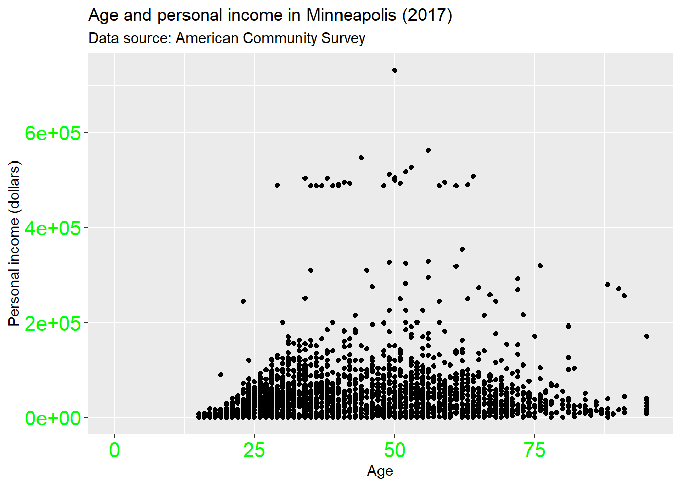
Change the attributes of the axis ticks.
p + theme(
  axis.ticks = element_line(size = 1.5)
)
## Warning: Removed 454 rows containing missing values (geom_point).
And y label.
p + theme(
  axis.title.y = element_text(size = rel(1.5), angle = 30)
)
## Warning: Removed 454 rows containing missing values (geom_point).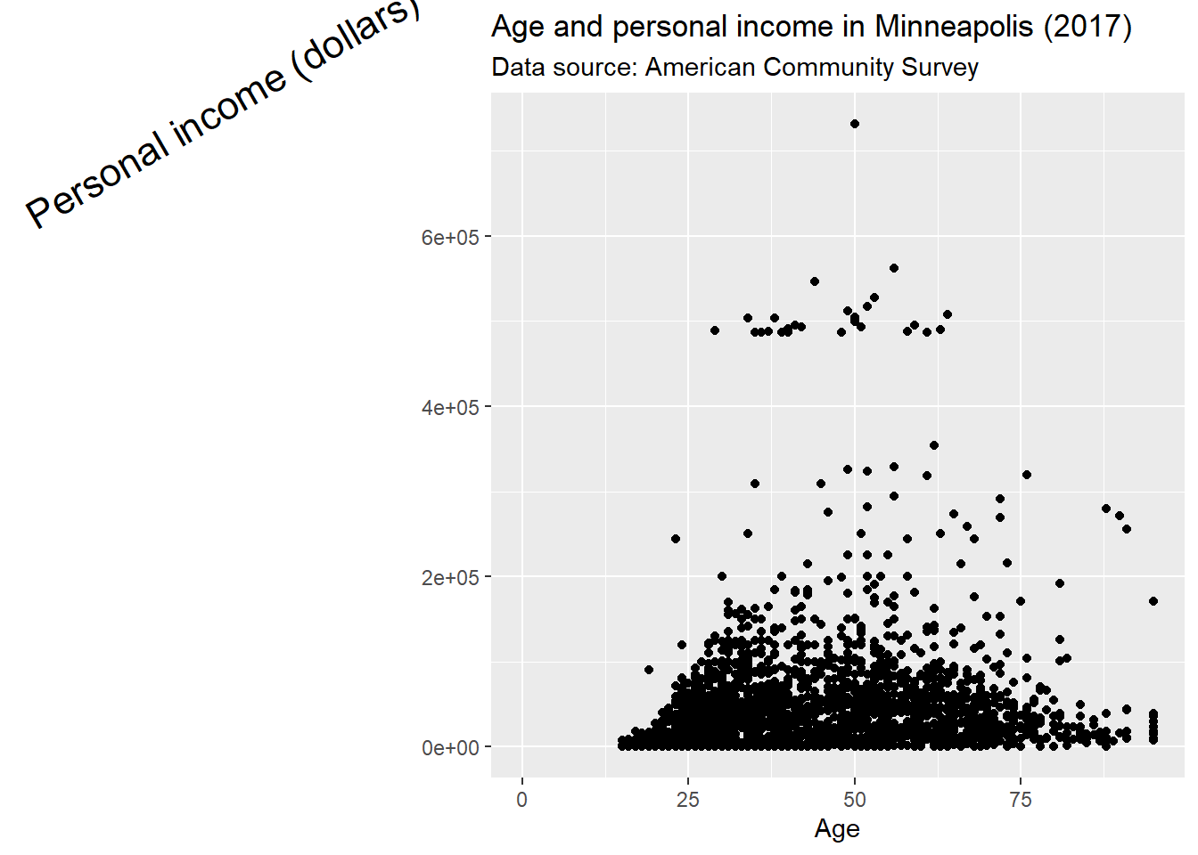
Now, let’s see what we could do for the legend.
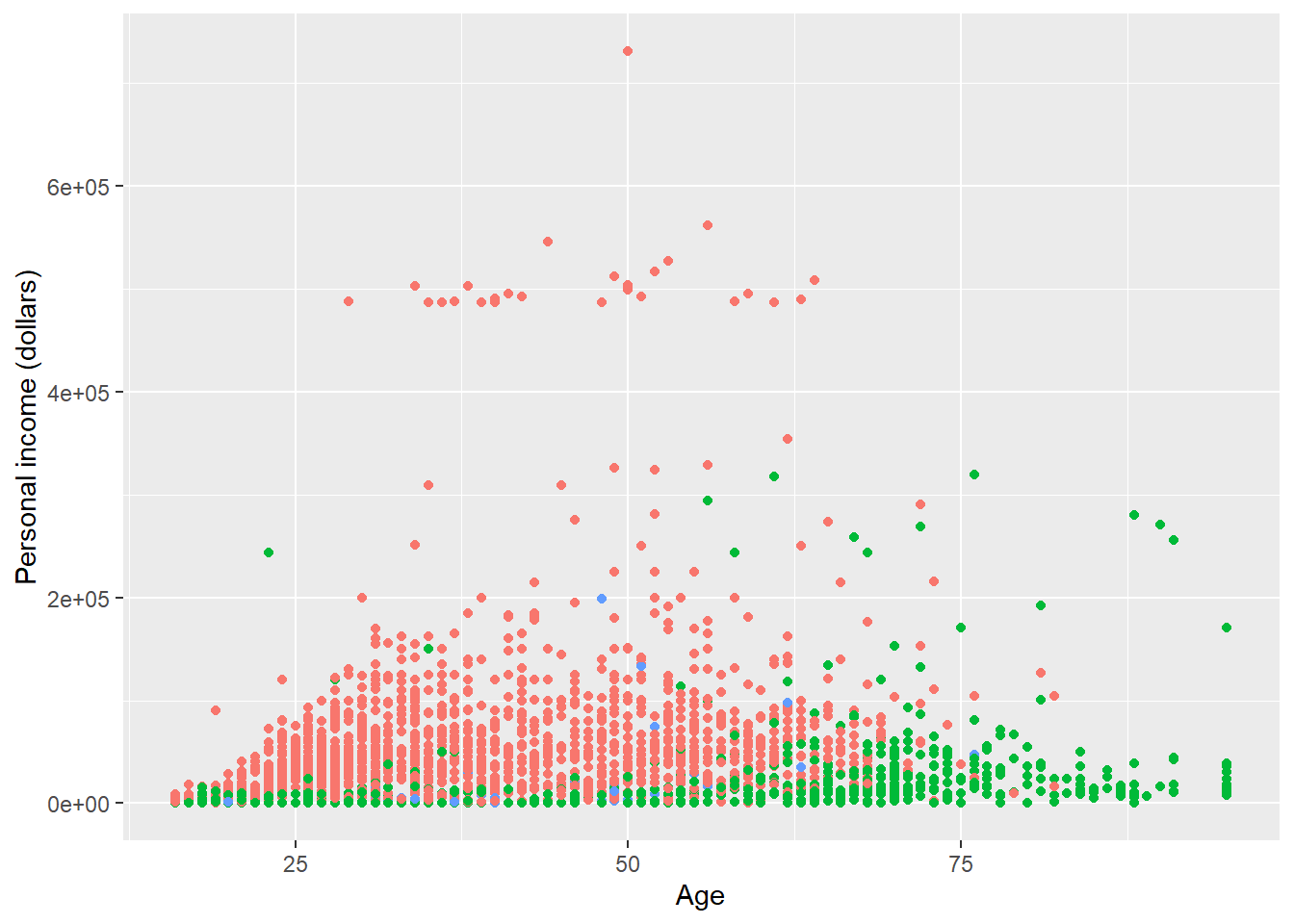
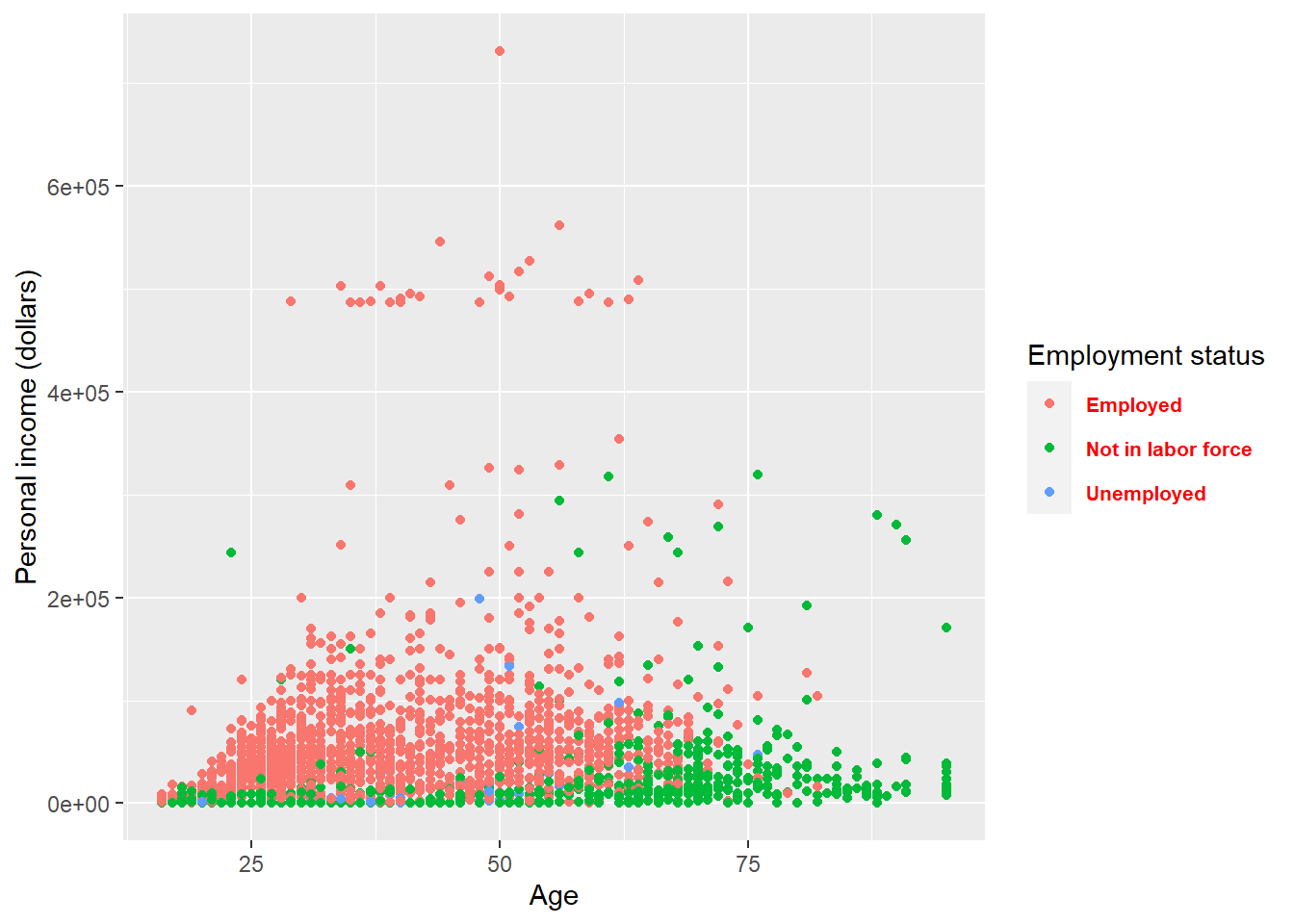
p <- ggplot(minneapolis_emp, aes(AGE, INCTOT, color = factor(EMPSTAT))) +
  geom_point() +
  labs(
    x = 'Age',
    y = 'Personal income (dollars)',
    color = 'Employment status'
  )

p ## original plot
Remove the legend by setting its position as legend.position = 'none'.
p + theme(
  legend.position = 'none'
)
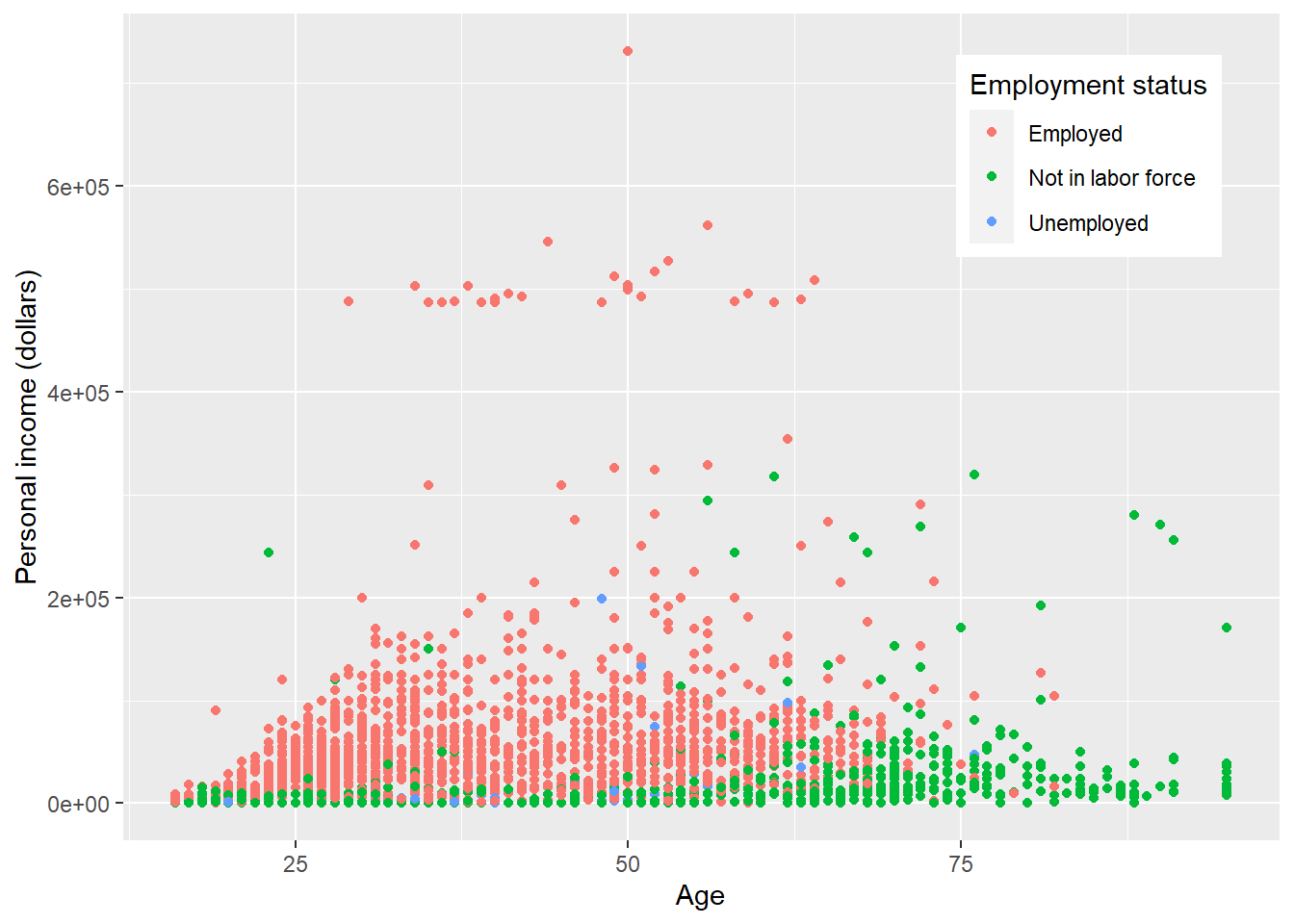
p + theme(
  legend.position = 'top'
)
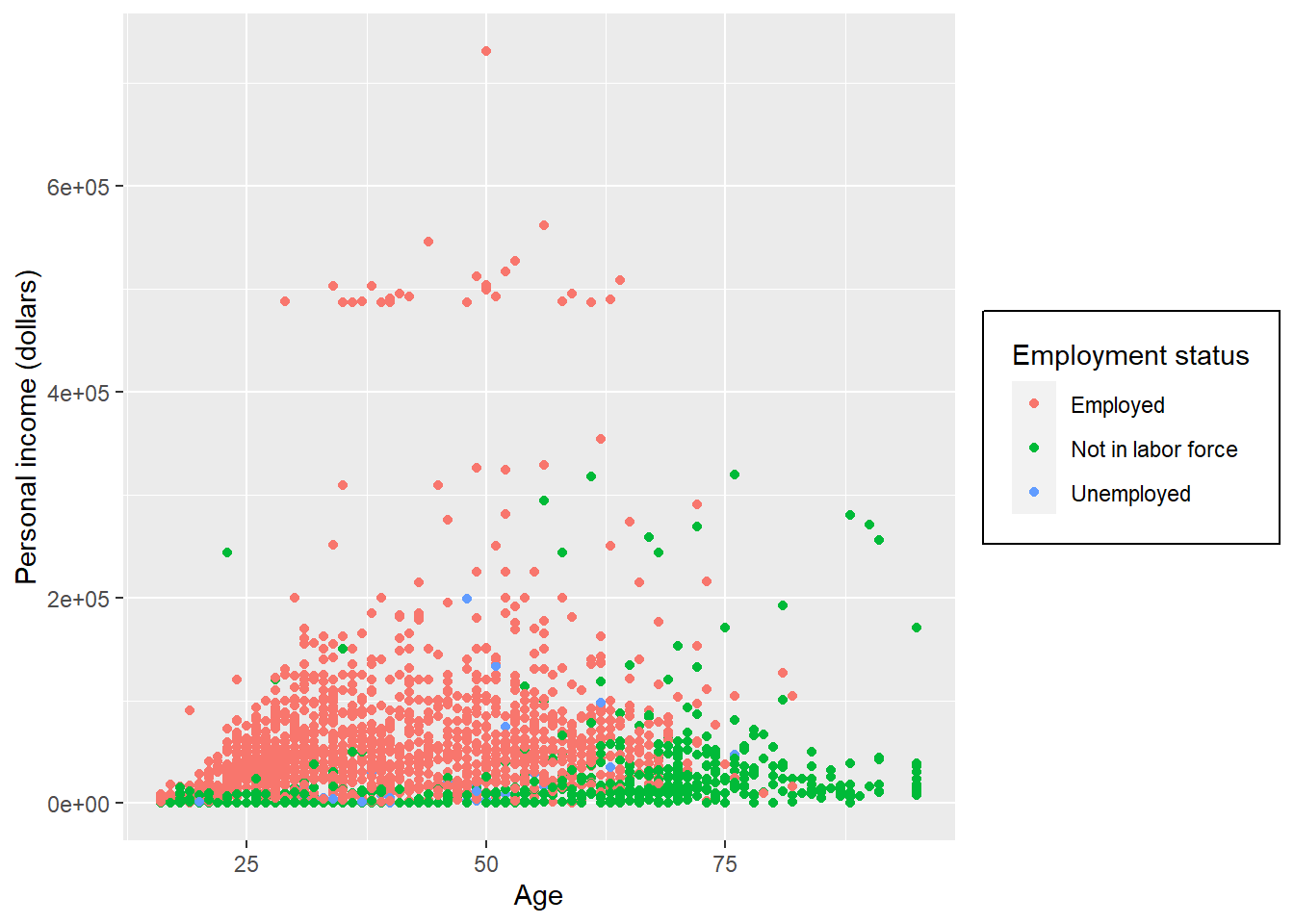
By setting legend.justification for the legend, we anchor point for positioning legend inside plot (“center” or two-element numeric vector) or the justification according to the plot area when positioned outside the plot
p + theme(
  legend.justification = 'top'
)
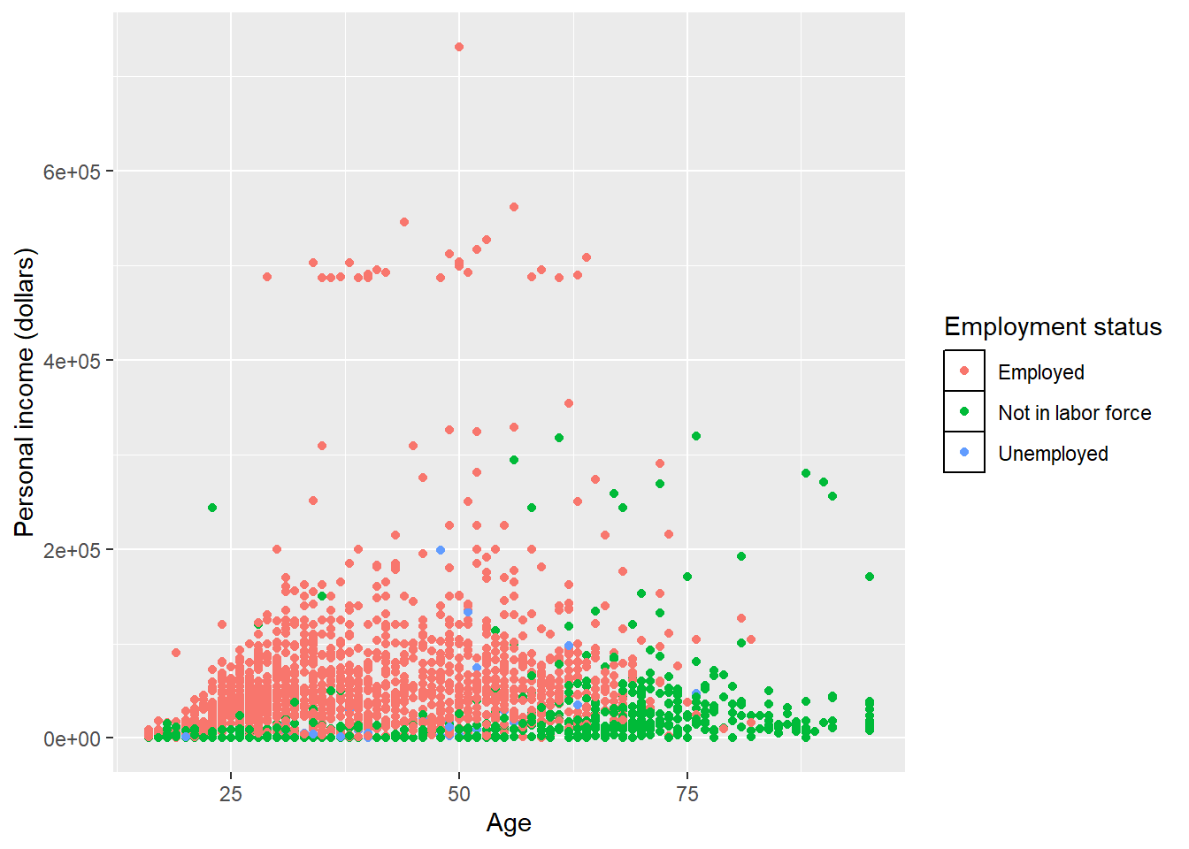
p + theme(
  legend.position = c(.95, .95),
  legend.justification = c('right', 'top'),
  legend.box.just = 'right'
)
p + theme(
  legend.box.background = element_rect(),
  legend.box.margin = margin(6, 6, 6, 6)
)
Set attributes for the key of the legend.
p + theme(
  legend.key = element_rect(fill = 'white', colour = 'black')
)
Set attributes for the text of the legend.
p + theme(
  legend.text = element_text(size = 8, colour = 'red', face = 'bold')
)
If you do not like to customize the theme one element by one element. ggplot2 also provides some function which give you a complete theme. For example, the theme_bw() we used at the start of this lecture. Note that complete theme can cover the setting of theme before it (not those after it).
p + theme_bw()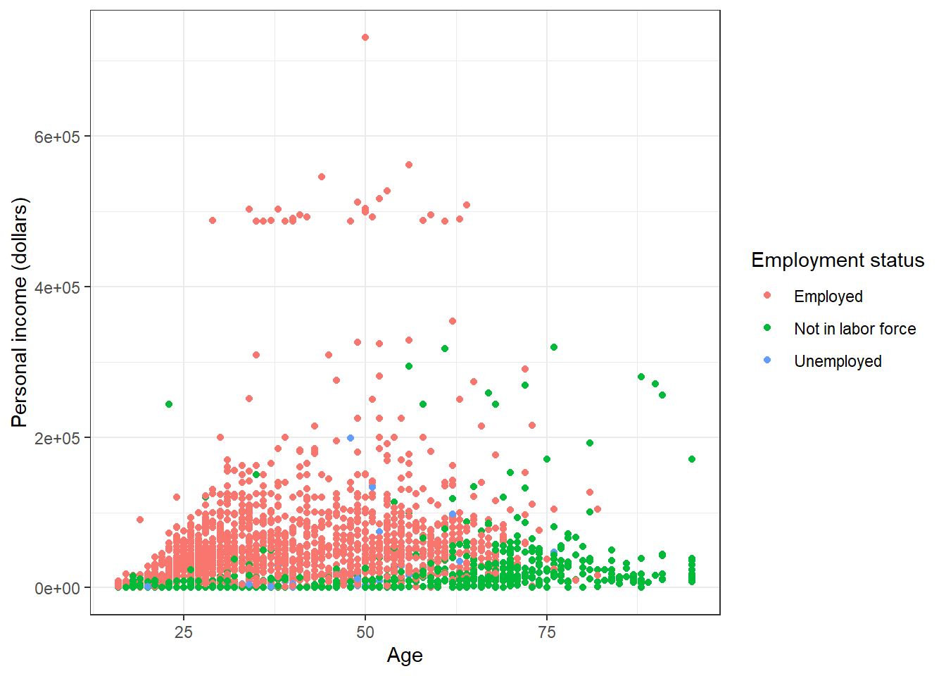
p + theme_minimal()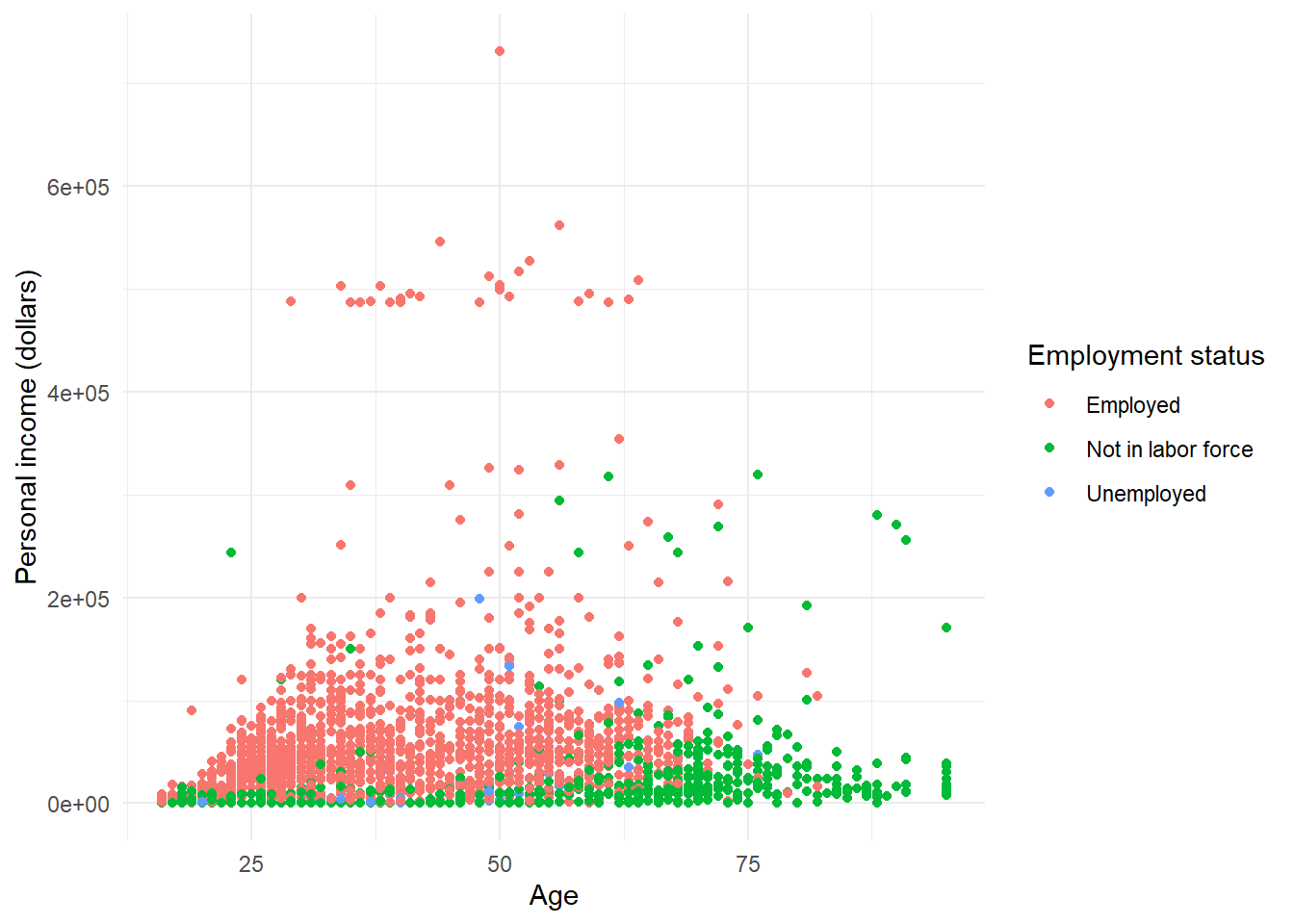
p + theme_dark()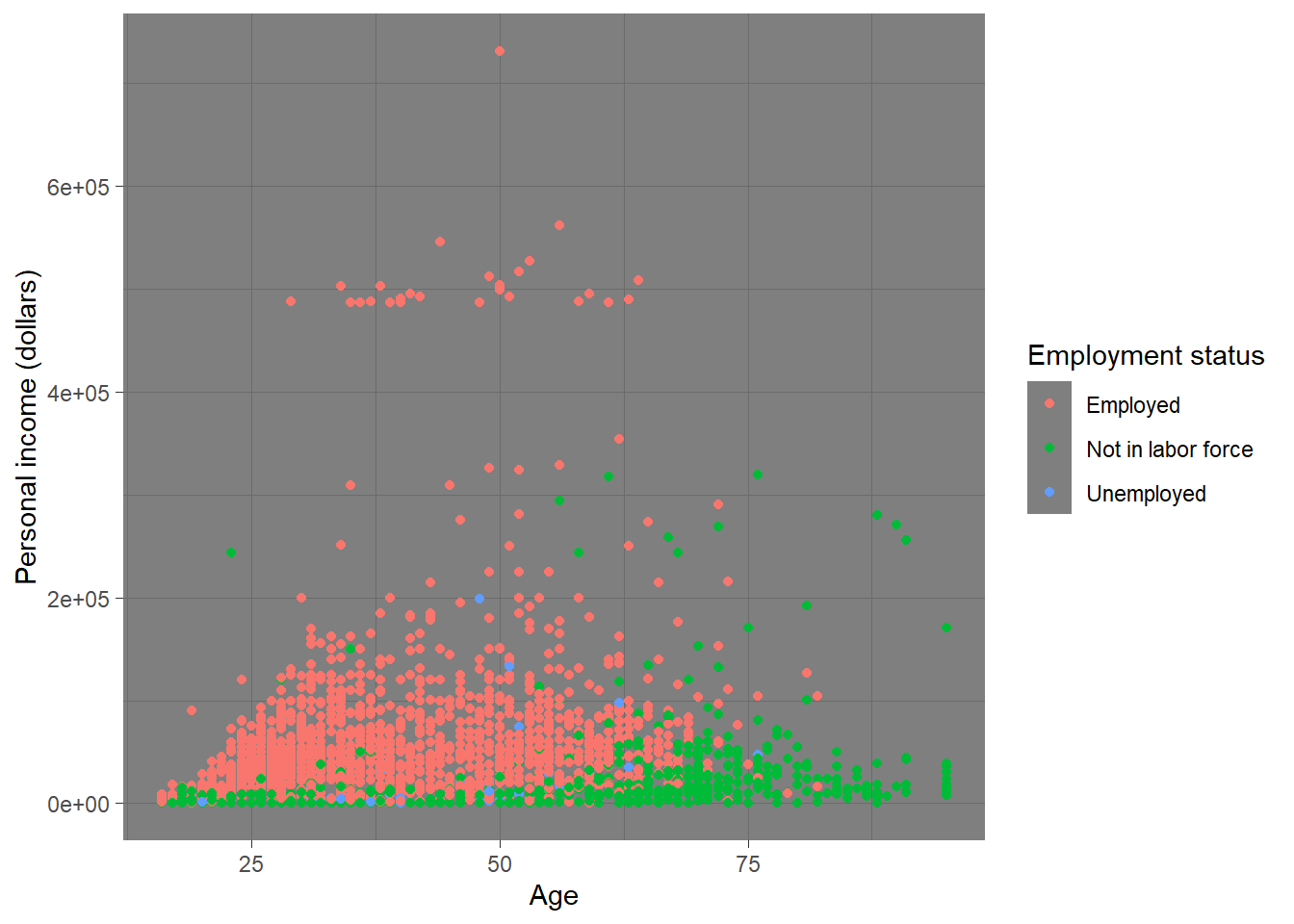
Please check here for more complete theme.
7.6 Save plot
You can use ggsave() to save the current plot. You need to specify the name (including file extension such as jpg, png) of the plot in the function.
ggsave('plot.jpg', width = 5, height = 5)